Use Superset with Fusion SQL
Apache Superset is a powerful and widely used SQL exploration and visualization tool. This topic explains different ways to use it with Fusion 5.
In Fusion 5.4 and up, Superset is deployed by default as part of your Fusion platform. In earlier versions of Fusion, you must install Superset and the Fusion SQL SQLAlchemy dialect separately.
Enable and connect to Superset
| Fusion 5.1-5.3 | Fusion 5.4 and up |
|---|---|
|
|
Create a Superset database
After the SQLAlchemy dialect is installed it’s time to set up a connection to the database.
-
In Superset, navigate to Data > Databases:

-
Click the + Database button in the upper right corner to create a new database:

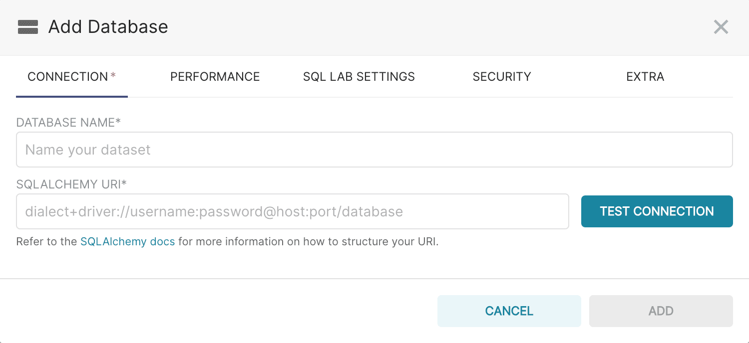
The Add Database screen appears:
-
Add a name for the database.
-
Add the SQLAlchemy URI in the following format:
fusion_sql://USERNAME:PASSWORD@<fusiondomain>:<fusion_ssl_port>/fusion/default
The Superset connector uses SSL for connections and queries and will only connect to the Fusion SSL port. If this command does not work, it is possible there are issues with reaching your Fusion proxy. Enter the following to add the SQLAlchemy URI:
fusion_sql://USERNAME:PASSWORD@<fusion_proxy>:<fusion_proxy_port>/fusion/default
The superset SQL selects are written to the SQL Service Pod log for review and troubleshooting purposes. -
Click Test Connection to make sure the connection is working.
-
Click Add.
Create a Superset dataset
Once a database is created, datasets (also called tables) can be set up.
-
Navigate to Data > Datasets:

The Datasets screen appears.
-
Click the + Dataset button in the upper right corner:

-
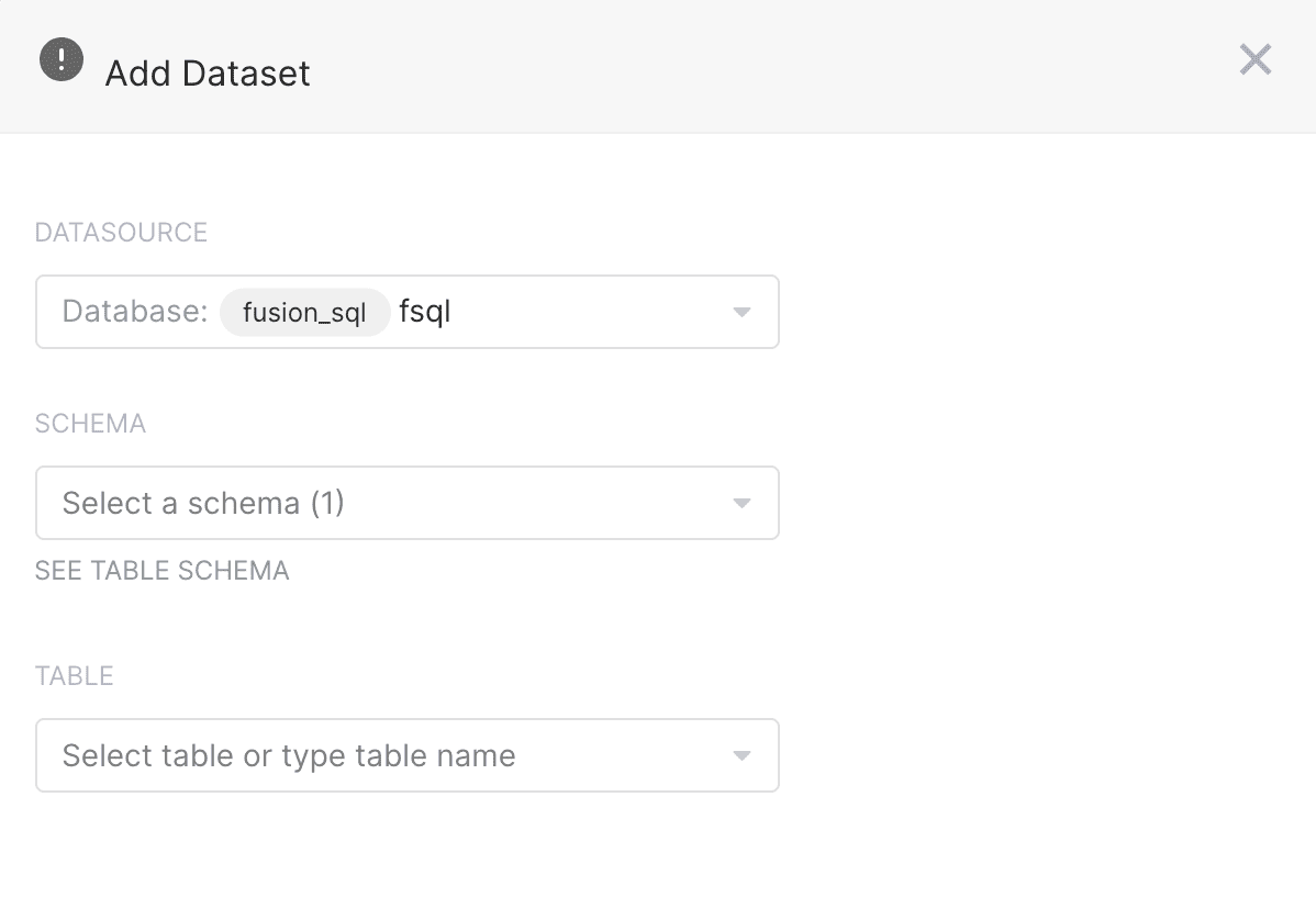
Create a dataset by specifying the Database, Schema, and Table Name. The schema is always “default”.
-
Click Add to save the dataset.
Your first chart: bar chart
In this section we’ll create our first chart. More time will be spent on the process of creating charts in this section than in following sections which will only deal with the specifics of the different kinds of charts.
-
Navigate to +New > Chart:

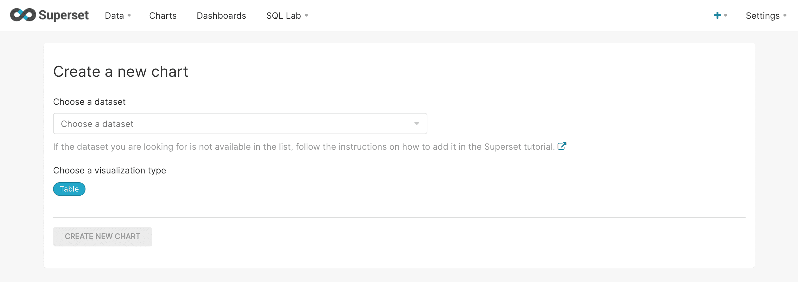
The Create a new chart screen appears:
-
Select a datasource (also called a table) from which to create the chart.
-
Click Table to change the visualization type.
-
Select the Bar Chart visualization type:
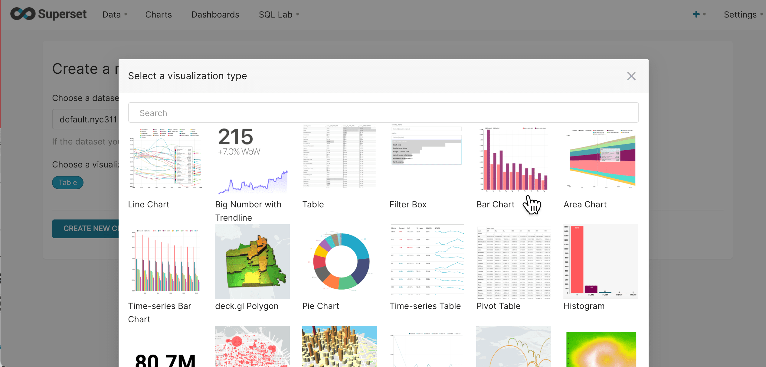
-
Click Create new chart:
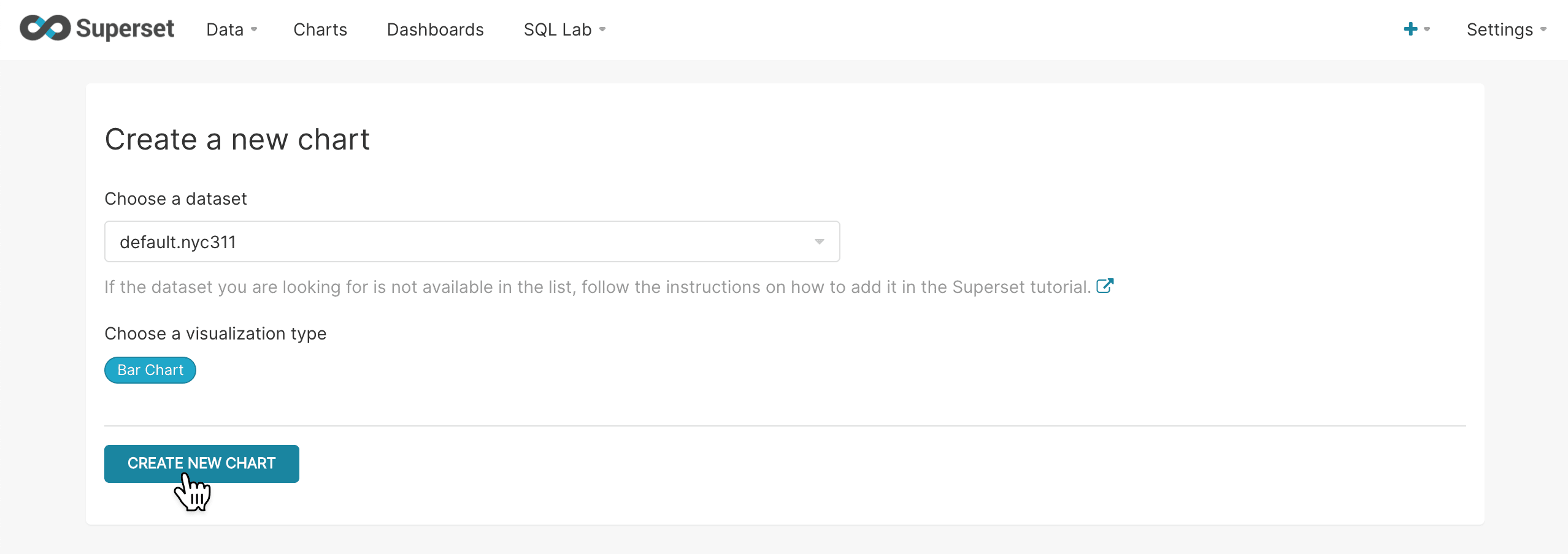
The chart configuration screen appears:
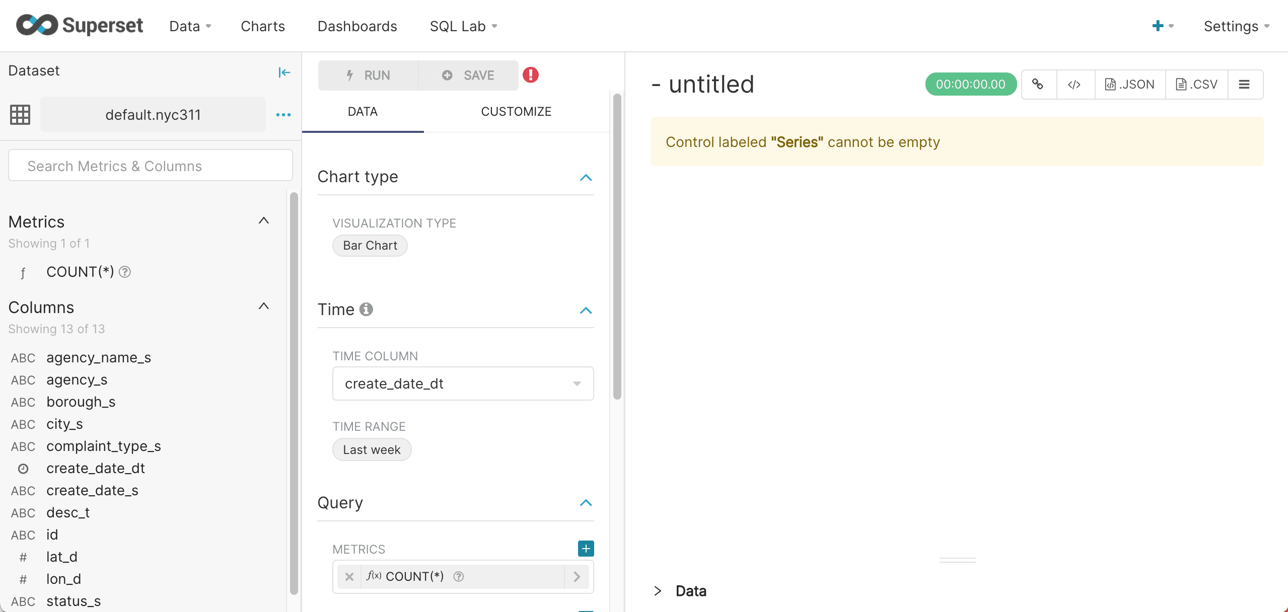
The chart can be configured using the left hand panel and will display on the right.
The first step is to turn off the Time Range filter. Time filters, if needed, can be added back in after seeing the initial results.
-
To turn off the Time Range filter, click Last week, then Range Type, and select No filter.
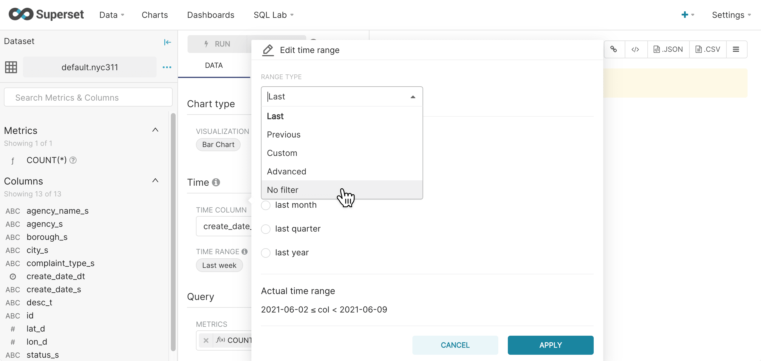
-
Click Apply.
-
Select a Metric from the metrics drop down.
In this example the
COUNT(*)metric is chosen. The metric will be the y-axis of the bar chart.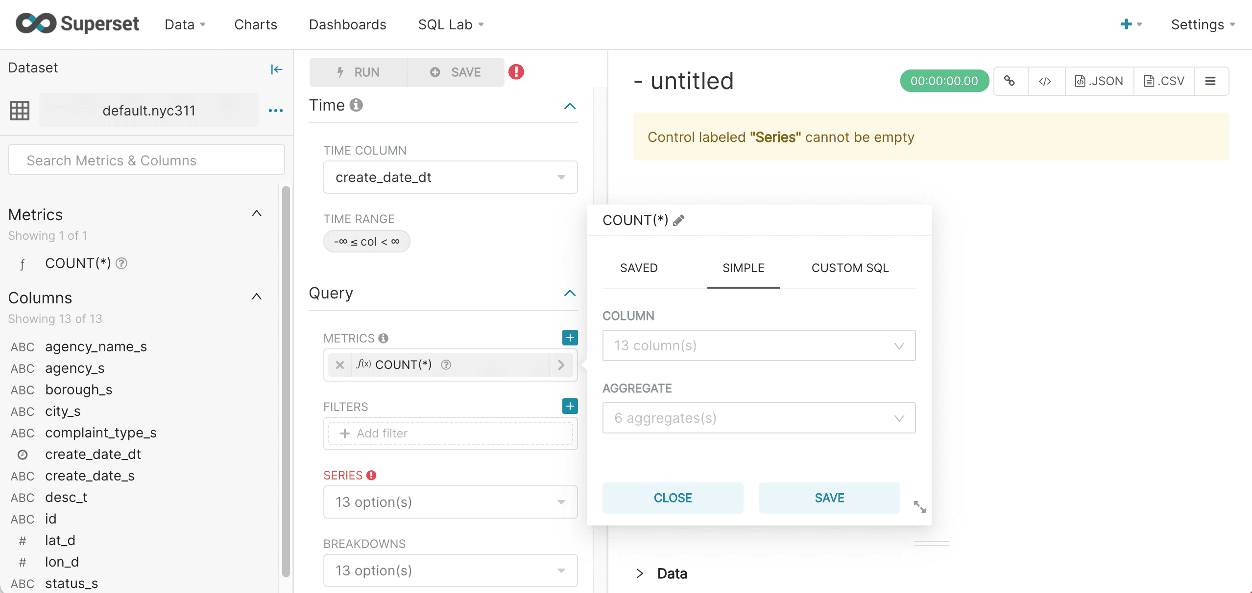
-
Select a Series, which will be the x-axis of the bar chart.
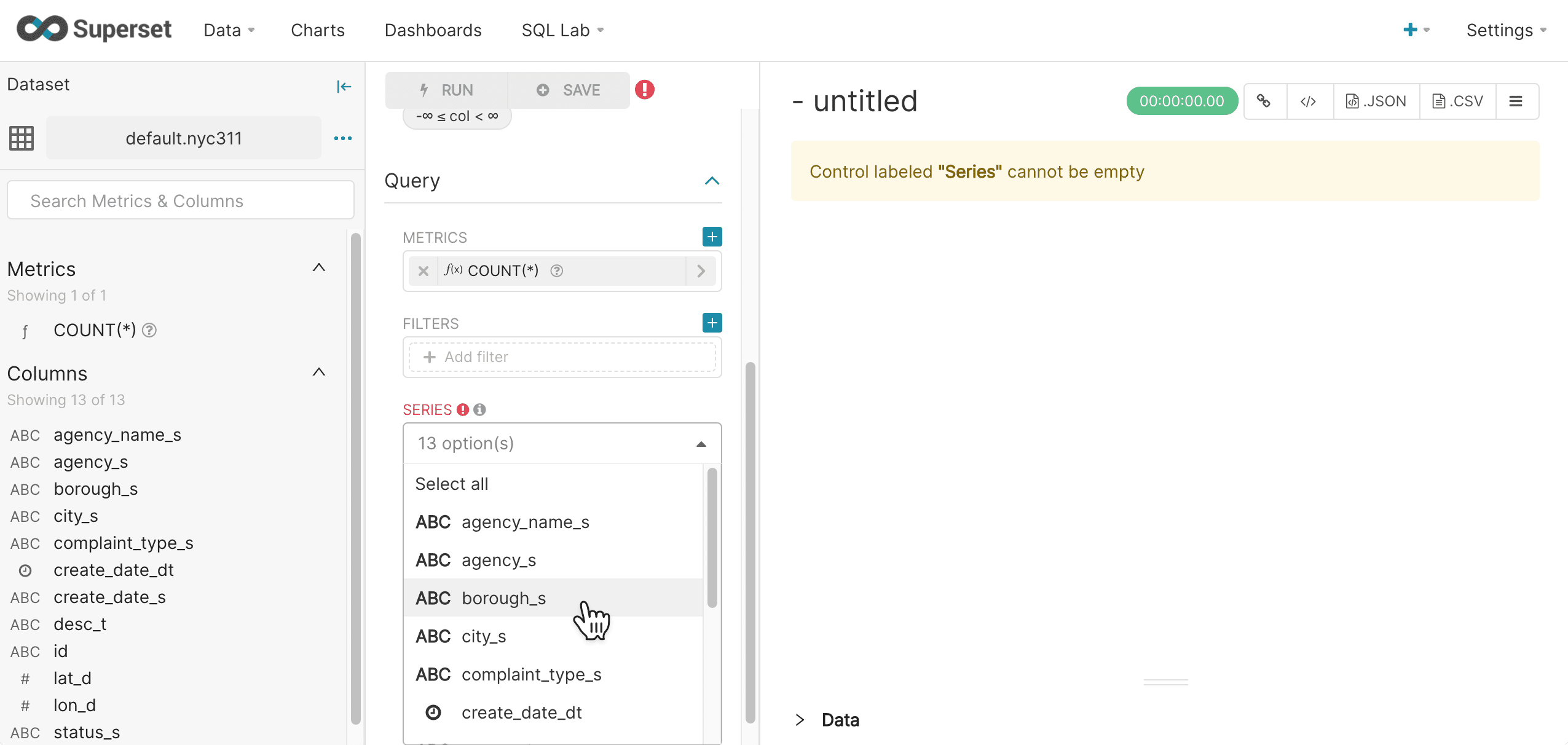
-
Click the Run Query button. This will execute the query.
If the query is successful, a bar chart appears in the right panel:
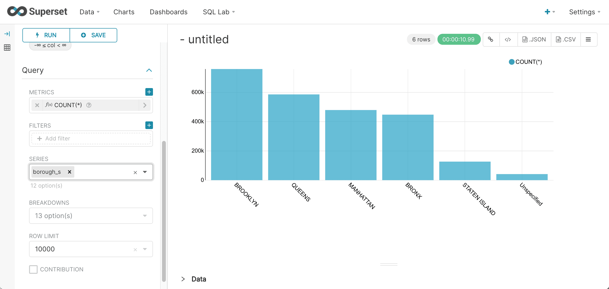
-
Add a filter by clicking on the Filters control:
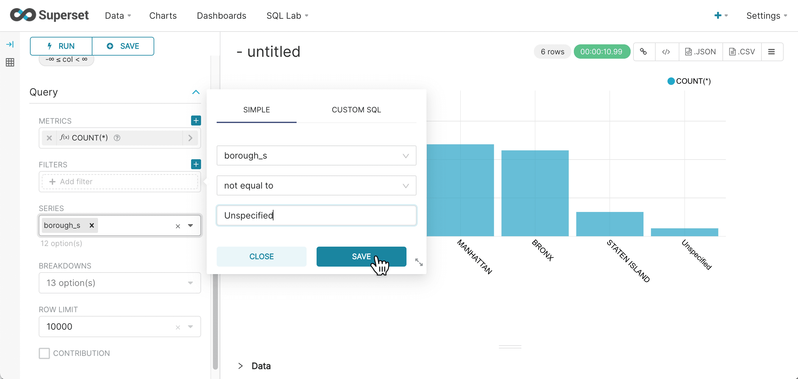
-
Click Save.
-
Rerun the query to see the results:
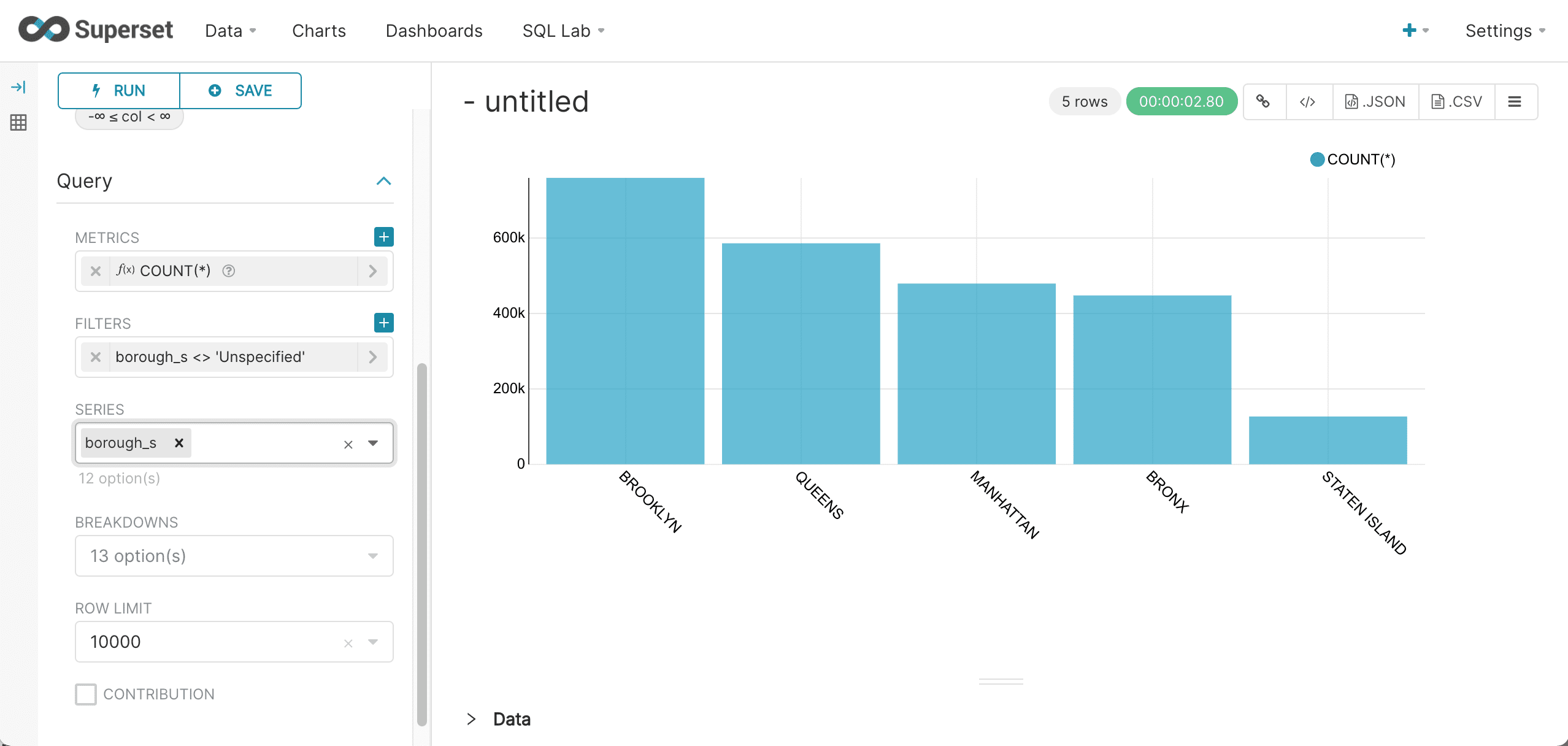
-
Click on the “Untitled” chart title to give the chart a new title:
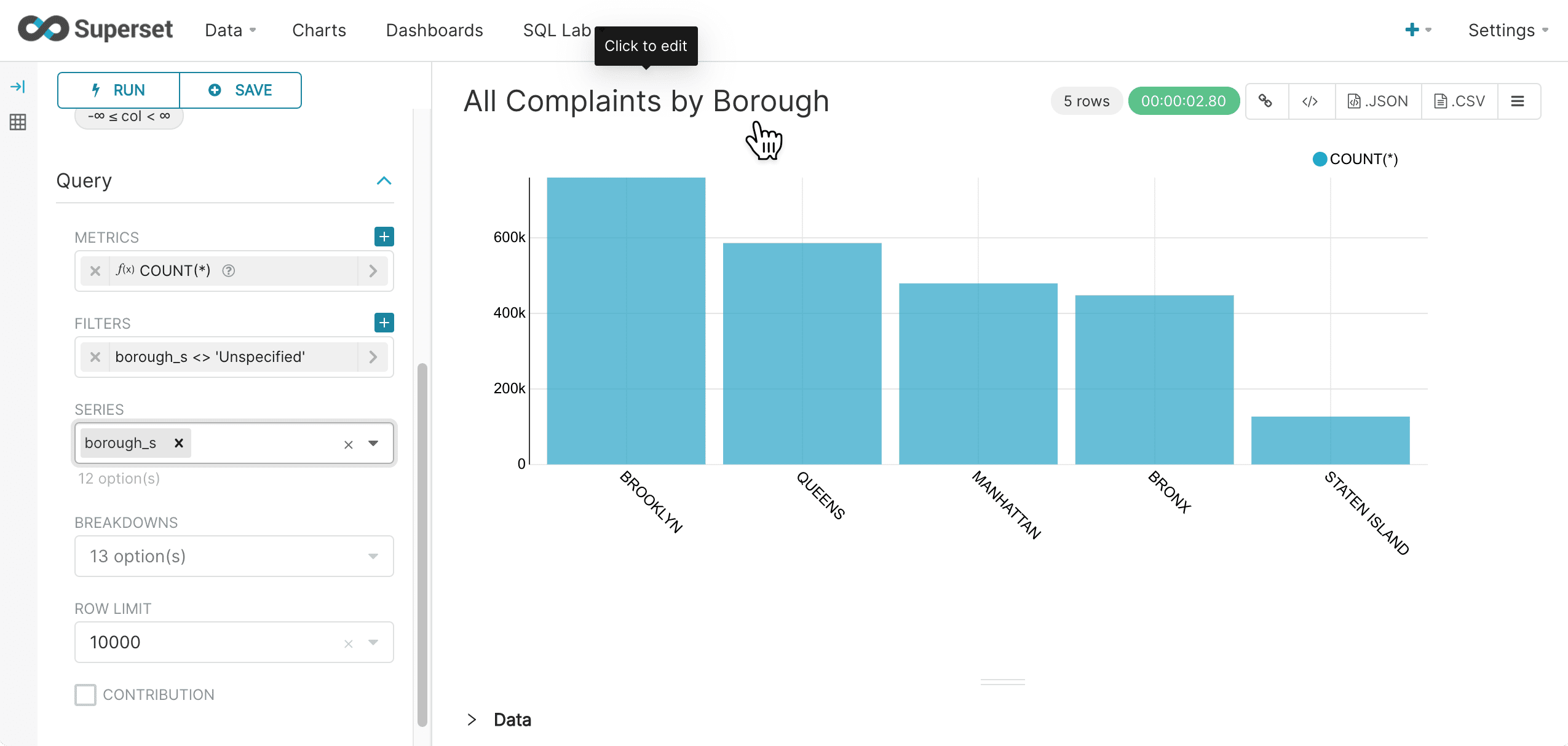
-
Select View query in the upper right to see the SQL query that was sent to Fusion SQL:
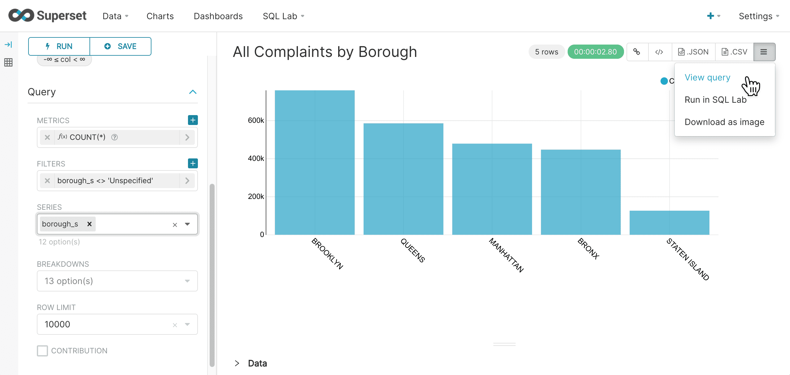
This brings up the query to review:
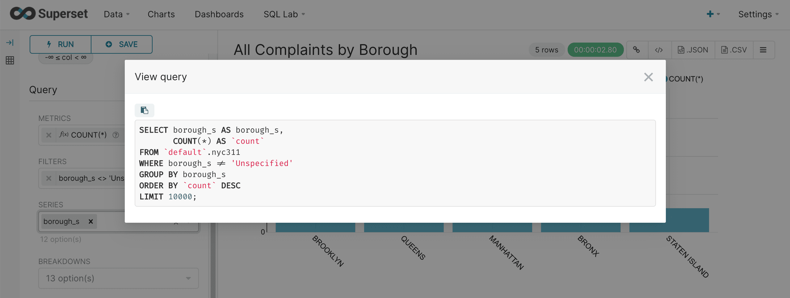
-
When the chart is complete, click Save in the upper left:

-
Enter a name for this chart and click Save:
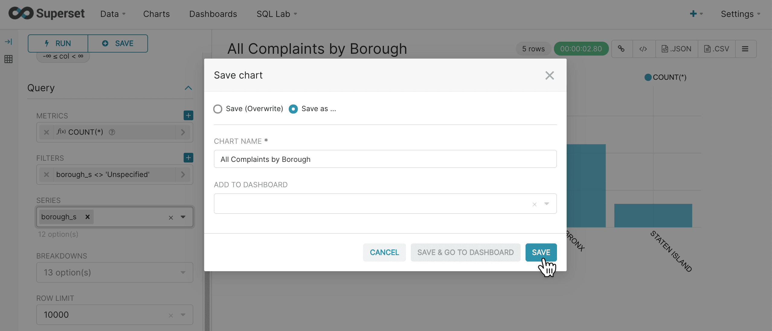
Once the chart is saved it can be added to dashboards later.
Dashboards
Once we have a chart saved we can add it to a dashboard.
-
Navigate to +New > Dashboard in the upper right hand corner:

This will take you to the dashboard screen:
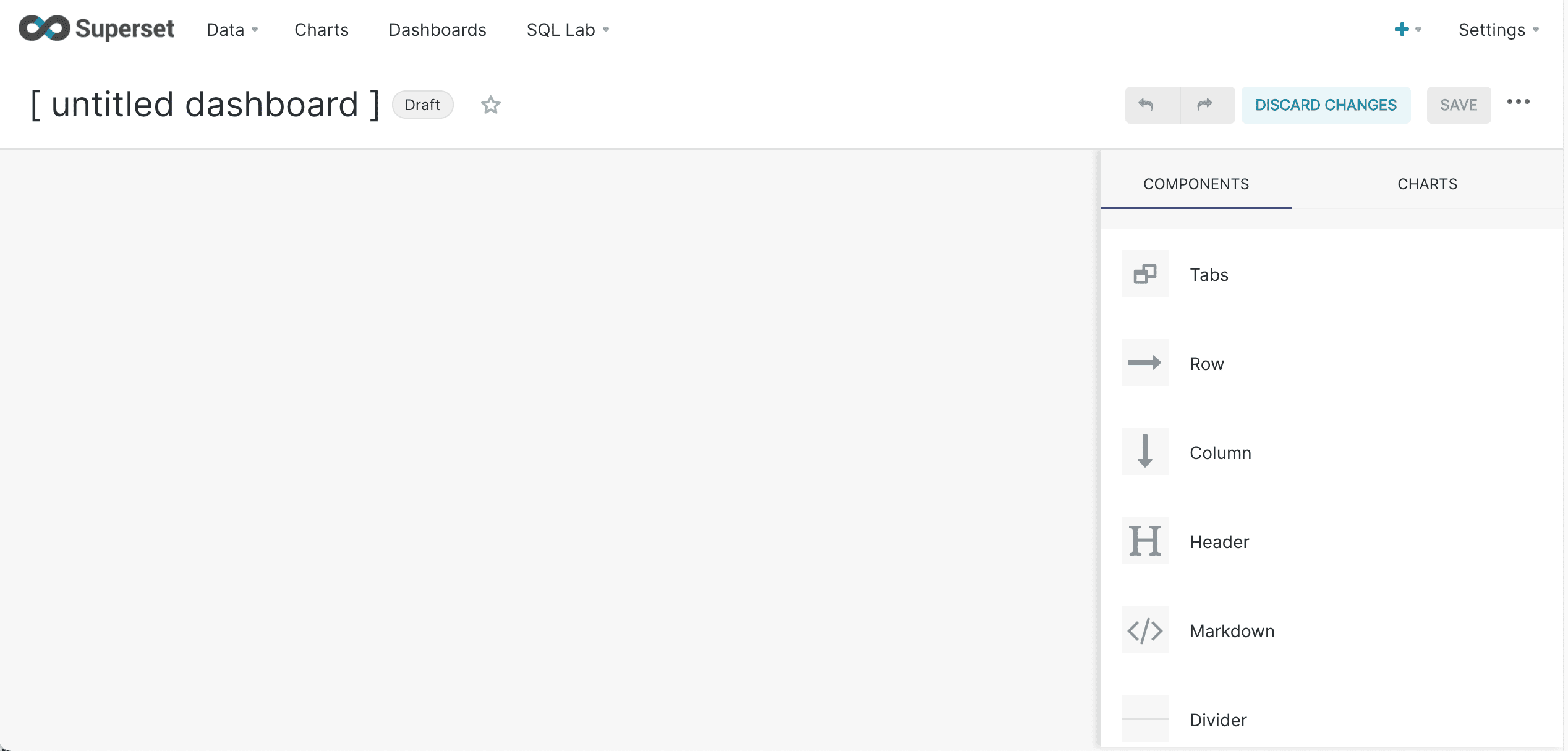
Dashboards are created by dragging components onto the dashboard.
-
Click Chart to find your saved charts:
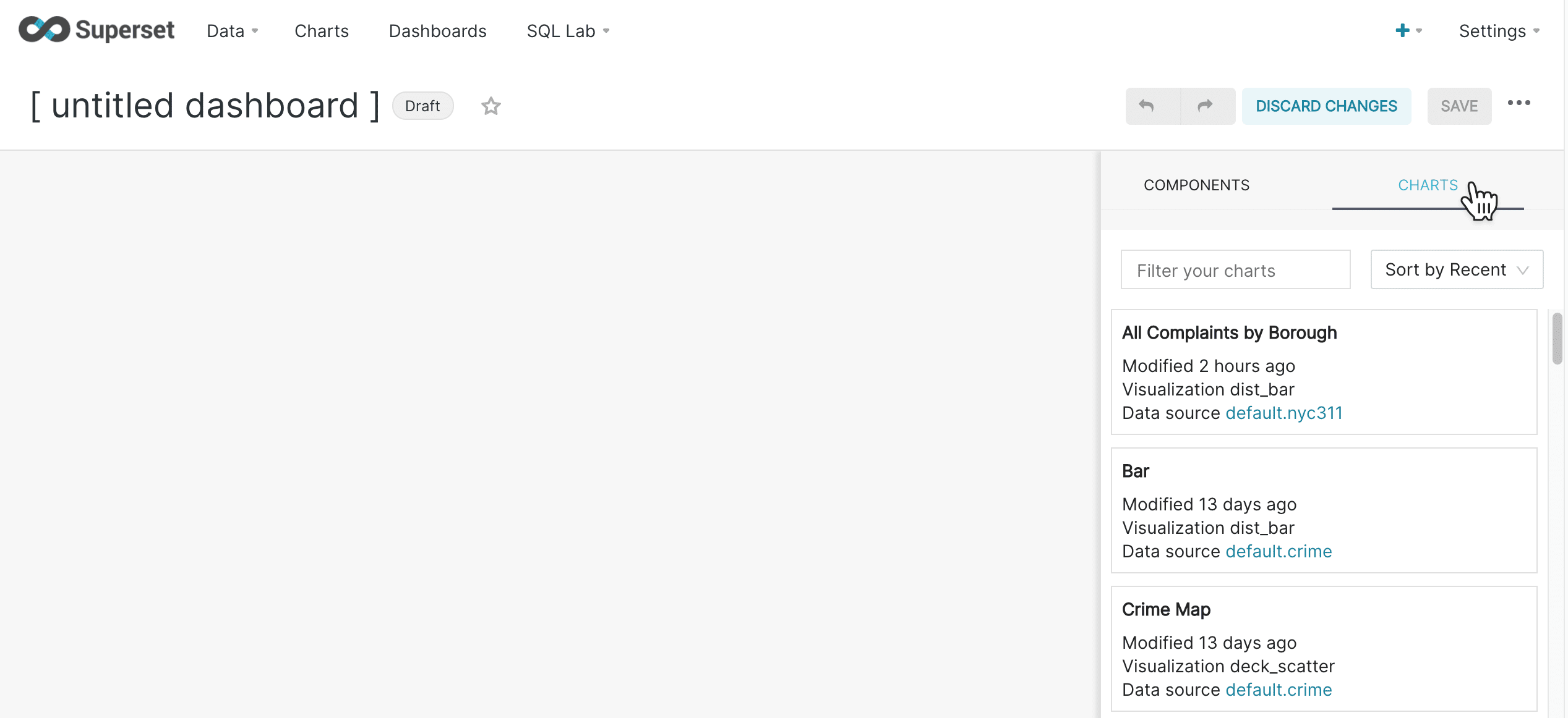
-
Drag your bar chart onto the dashboard and resize it by mousing over the bottom right corner and dragging the chart.
-
When the chart is sized properly, click Save Changes.
You can also title your dashboard by clicking on the title and changing it.
To drag items onto the screen, move them to the top of the component they will be placed in. A blue line will appear on the screen when the item is ready to be dropped. If the blue line is not on the screen, the item will not be dropped. 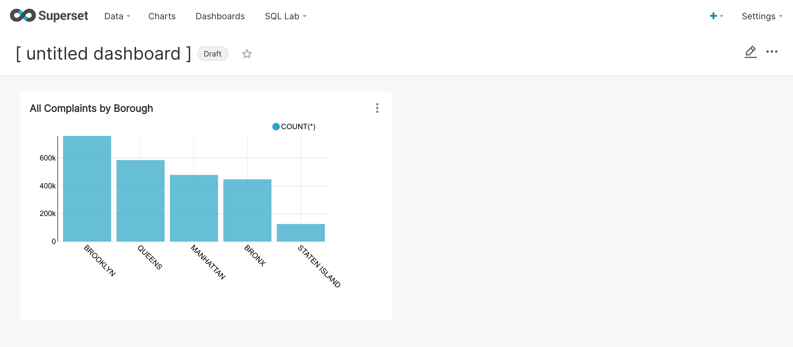
You can continue to add charts to your dashboard as more are created.
More Charts
Pie chart
Now that we have a basic understanding of charts, it’s very easy to create a pie chart. In fact, pie charts are very similar to bar charts. Below is an example pie chart:
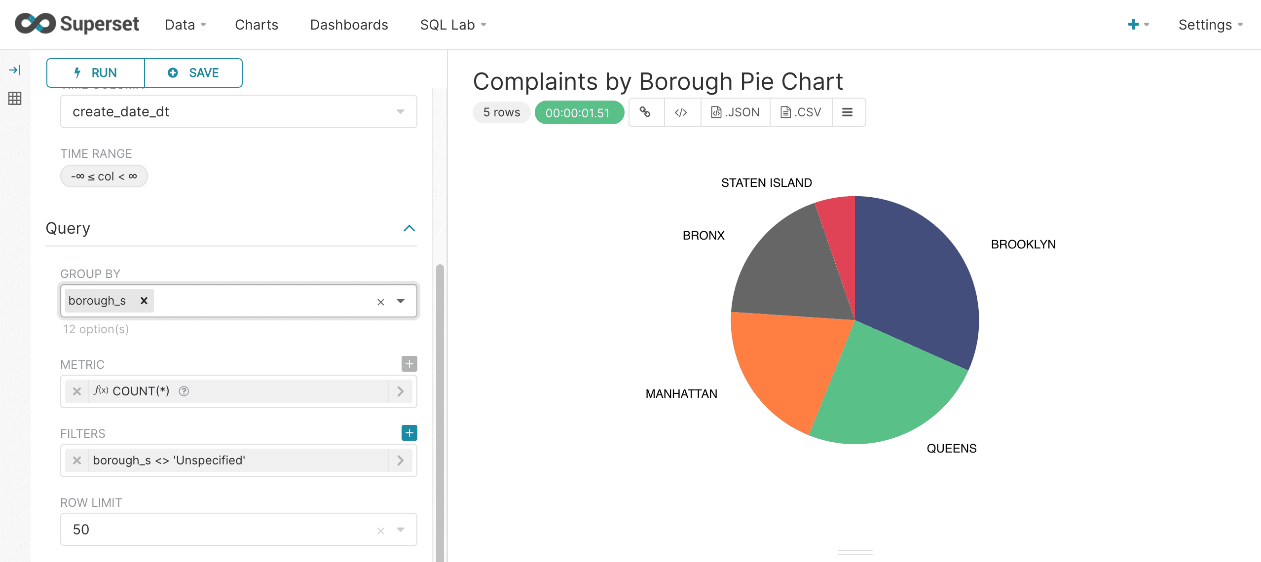
Notice that the Group By dropdown box is used instead of the Series dropdown in the bar chart. Otherwise the charts are configured the same way.
Histograms
Superset has a Histogram visualization which works perfectly with Fusion SQL’s random sampling capability.
The example below shows the simple configuration for a histogram. A numeric field is selected from the Numeric Columns drop down list and the row limit is set to 10000. Filters can be applied as needed. The number of bins can be controlled under Chart Options.
Once configured, Superset issues a basic select to Fusion SQL for the numeric field. In Fusion SQL all basic selects without an ORDER BY clause return random samples. This random sampling capability allows for histograms that can be used to represent much larger data sets.
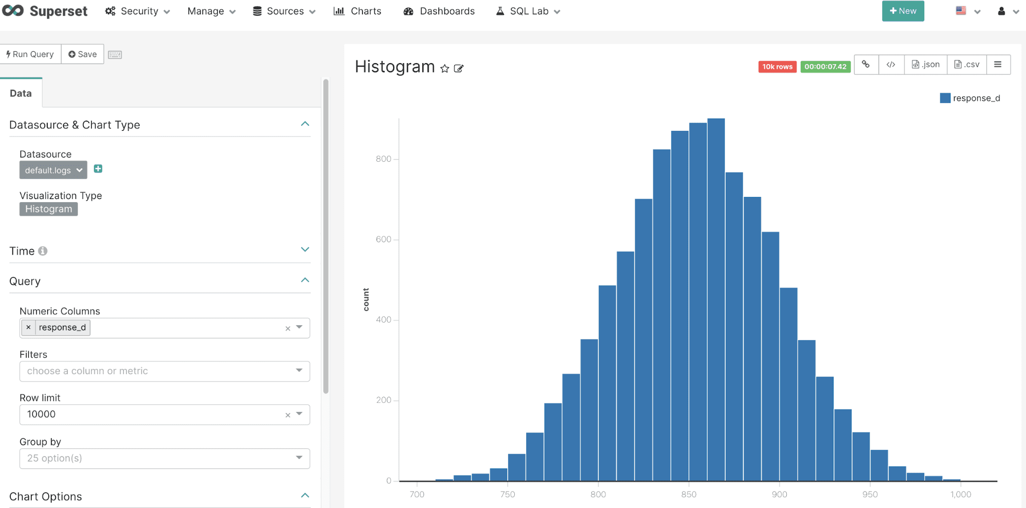
Viewing the query for this chart shows that no ORDER BY is used with the query resulting automatically in a random sample:

Pivot table
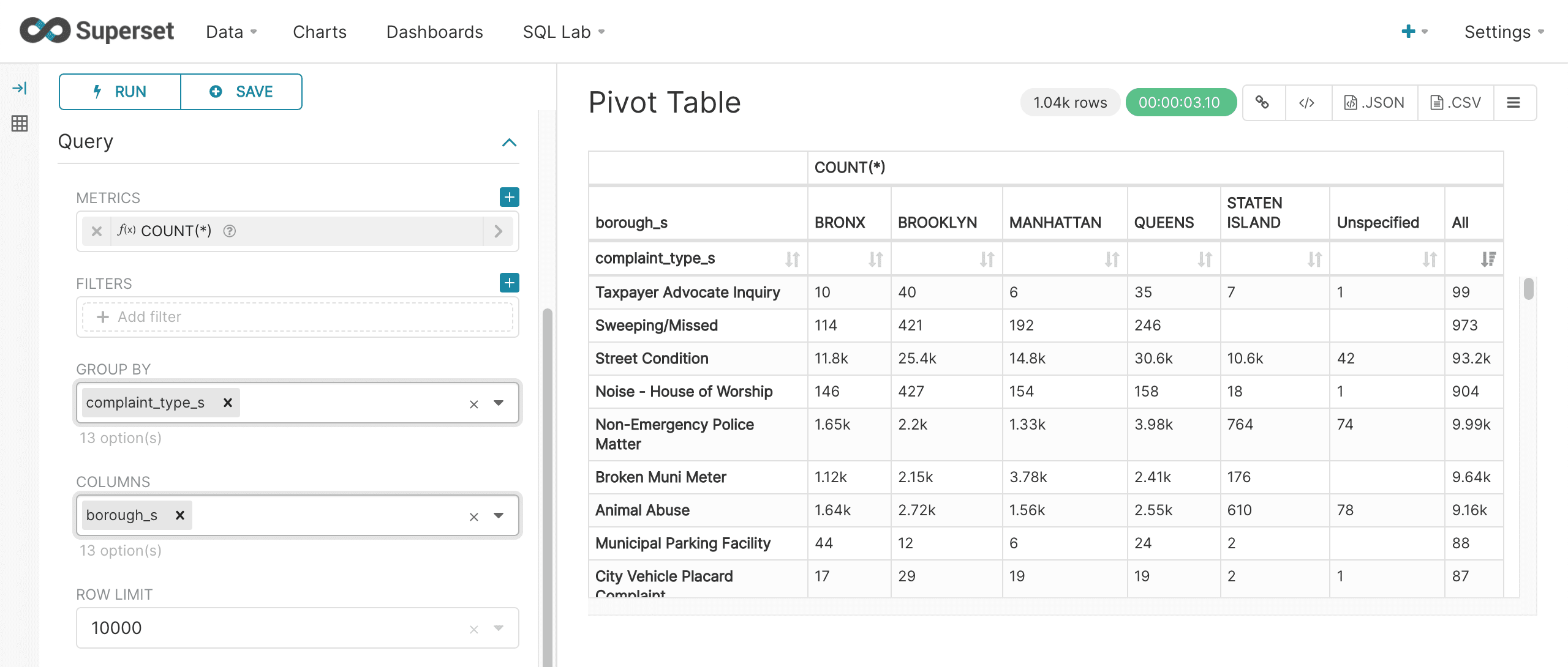
Superset’s Pivot Table visualization can be used to visualize a two dimensional aggregation. In the example below we see that the Pivot Table control panel has both a Group By and Columns dropdown. In this example the complaint_type_s field is selected as the Group By field and the borough_s field is selected as the Columns field. The COUNT(*) metric is being calculated across both fields.
This Pivot Table is then displayed with rows showing complaint types and the columns showing the boroughs. The count of complaints for each complaint type and borough populates the cells.
Map scatter plots
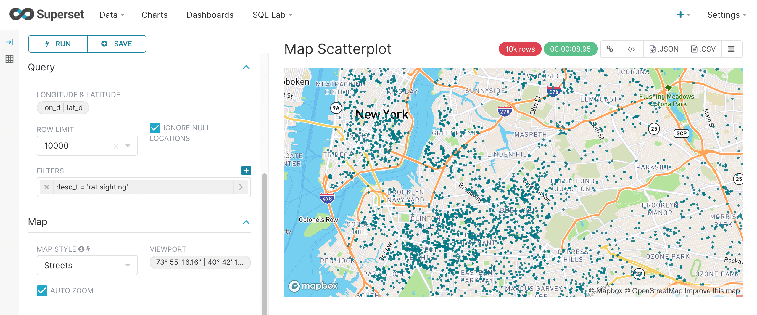
Superset has a number of powerful mapping visualizations. The deck.gl.Scatterplot is used to display a scatter plot of lat/lon points on a map. This particular visualization works perfectly with Fusion SQL’s filtering and random sampling capability.
In the example below the lat and lon fields in the table are configured and a row limit of 5000 is selected. A filter of "Rat Sighting" in the desc_t field is added to select complaints with "Rat Sighting" in the description field. This will return a random sample of 5000 lat, lon points with "Rat Sighting" in the description. The points can then be plotted on the map which can be zoomed and scrolled.
The random sample of points is a useful tool for revealing high density clusters on the map. This works because the probability of returning a point from a high density area is higher than a low density area.
|
For the map to render correctly, a Map Box key must be available for Superset at run time. In this example the Map Box key was exported to a unix environment variable before starting Superset as follows: export MAPBOX_API_KEY=pk.eyJ1IjoiZnVzaW9uc3FsIiwiYSI6ImNrOWtudXpzazAyaW8zbHFwOG50NXVyMGgifQ.ZTyPhJaYQEyqvWY5f-mWbw |
Map clustering
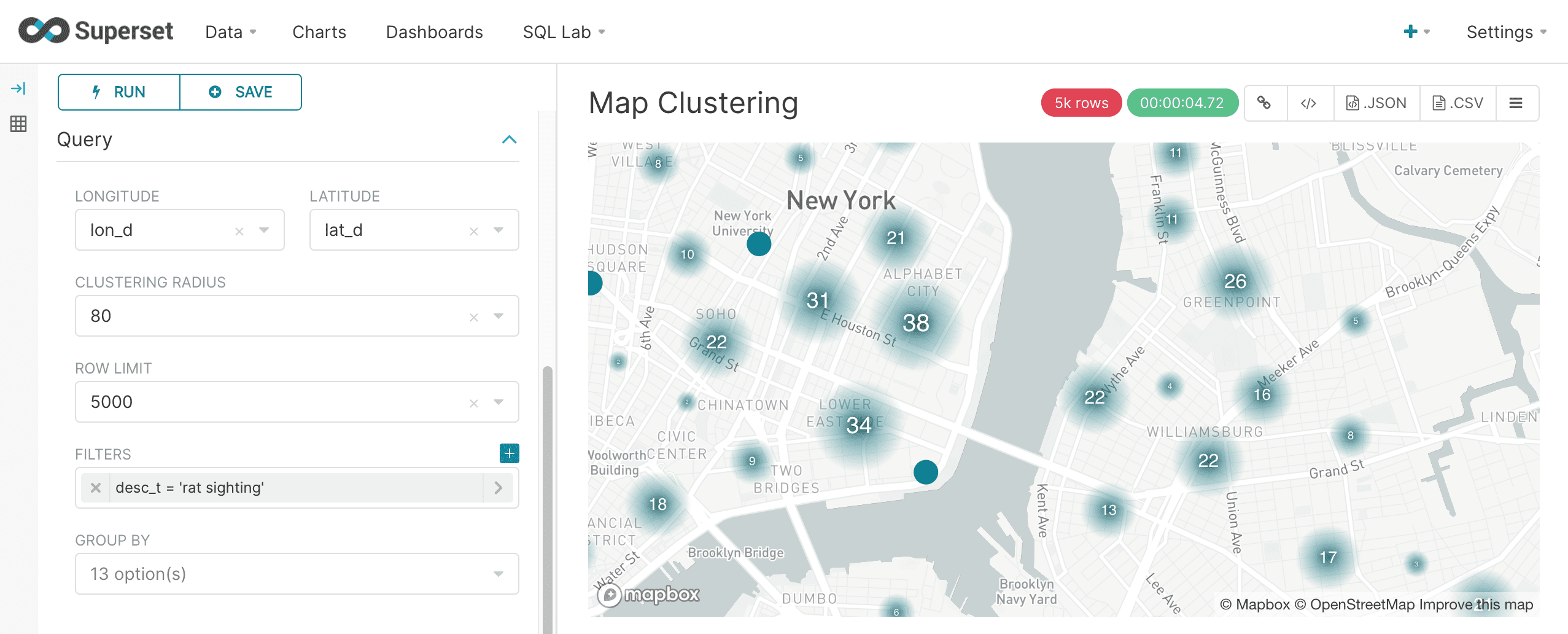
The Superset MapBox visualization is another powerful tool for visualizing geo-spatial data. Instead of a scatter plot the MapBox visualization clusters points on the map. Configuration of the MapBox visualization is very similar to the deck.gl.Scatterplot but with an added control for cluster radius. The example below shows the configuration and rendering of the MapBox visualization:
Sankey
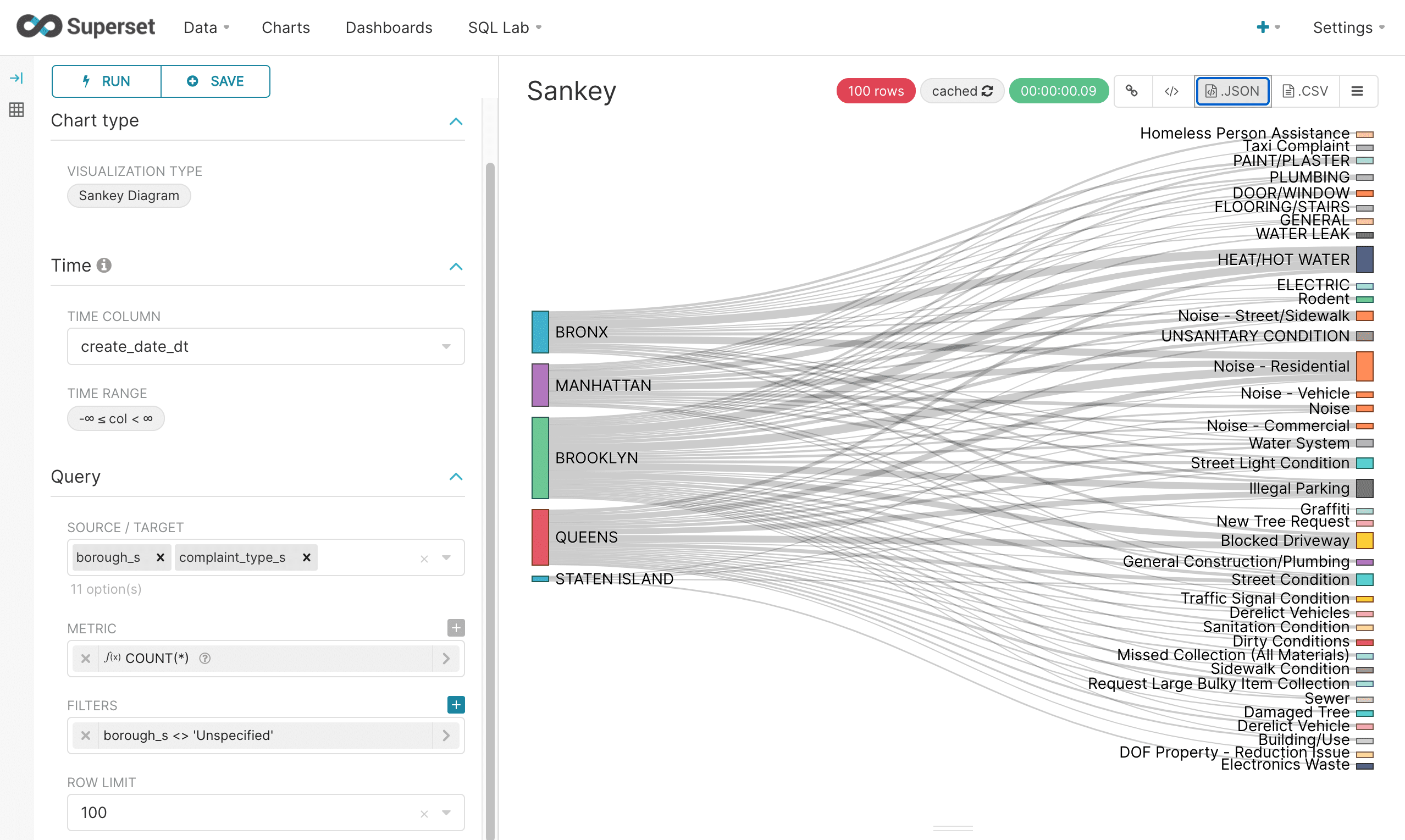
The Sankey Diagram is another way to visualize a multi-dimensional aggregation. With a Sankey Diagram the strength of the relationships between dimensions is shown by the width of the pathways between them.
In the example below a Sankey Diagram is configured by having the borough as the source and the complaint type as the target. The COUNT(*) metric is used to measure the strength of relationship between borough and complaint type. Under the covers a multi-dimensional SQL aggregation is run on Fusion SQL to create the data for the diagram.
SQL Lab
Up until this point we’ve been creating visualizations without actually writing any SQL directly. In the next sections we’ll explore how to use Superset’s SQL Lab to write SQL queries directly and then visualize the results.
The SQL Lab can be accessed by choosing the SQL Query option under the New button in the upper right corner:

The SQL Lab screen shows the meta-data for the databases, schemas and tables on the left side. In the main section of the screen there is a box for typing in SQL queries. The results display in a table below:
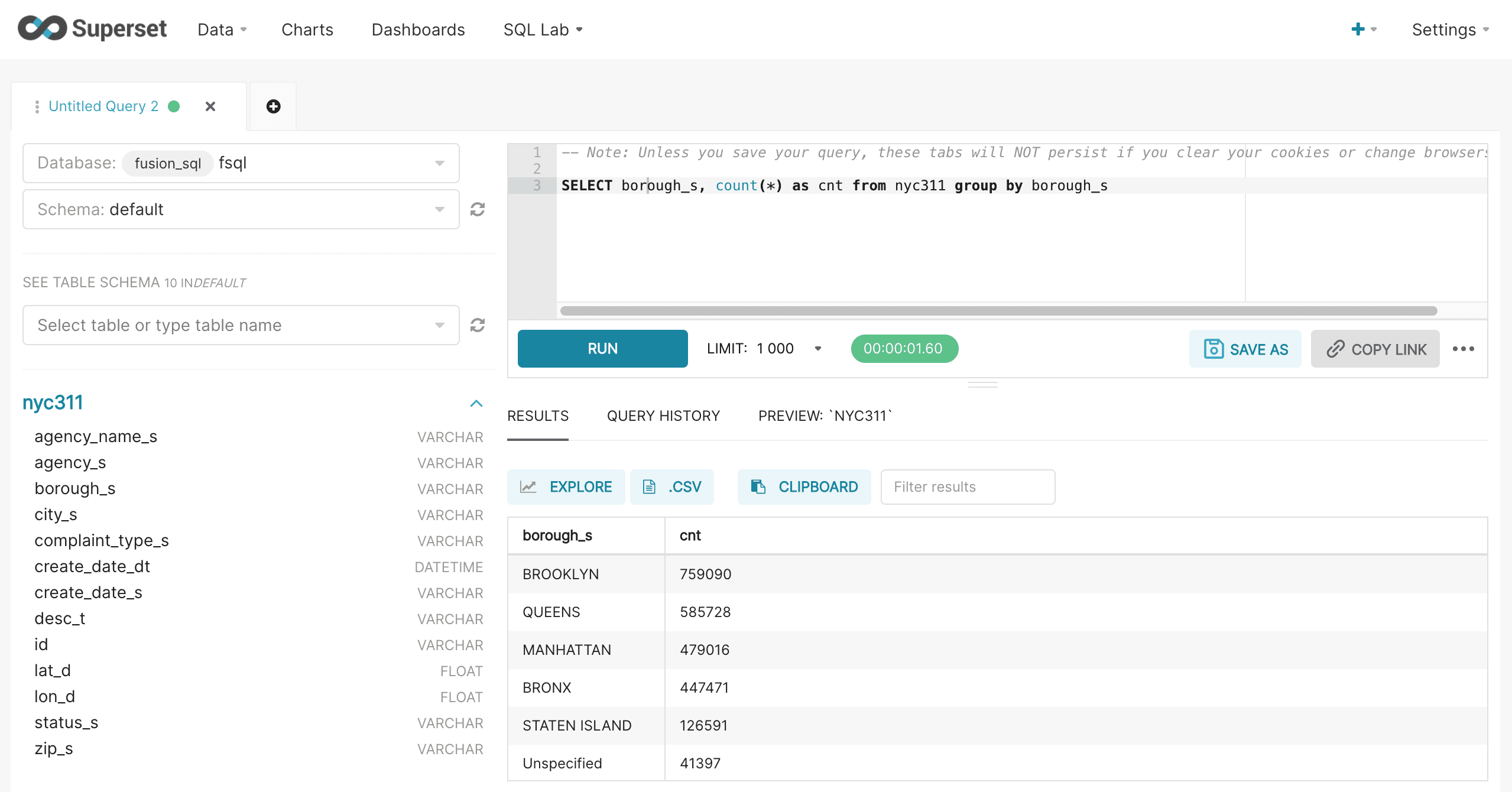
It’s important to note that Superset controls the LIMIT through the LIMIT control in the user interface. This will override any limits added to the query. Otherwise the SQL query will be issued exactly as it’s entered.
In this example a SQL aggregation is run and the results are displayed.
Once the results table is displayed the Explore button can be used to visualize the results. After clicking the Explore button the familiar chart creation screen will load.
The screenshot below shows the first steps in configuring the chart for this custom SQL query. First the Visualization Type is changed to "Bar Chart". Then the Time Range is set to "No filter".
Then the cnt field from the result set is selected as the Metric. Remember that in the SQL query the alias for the COUNT(*) metric was cnt. Superset by default will want to perform an aggregation on top of this, so we’ll choose the Custom SQL tab to override this behavior. In the Custom SQL tab simply remove the parentheses from around the cnt.
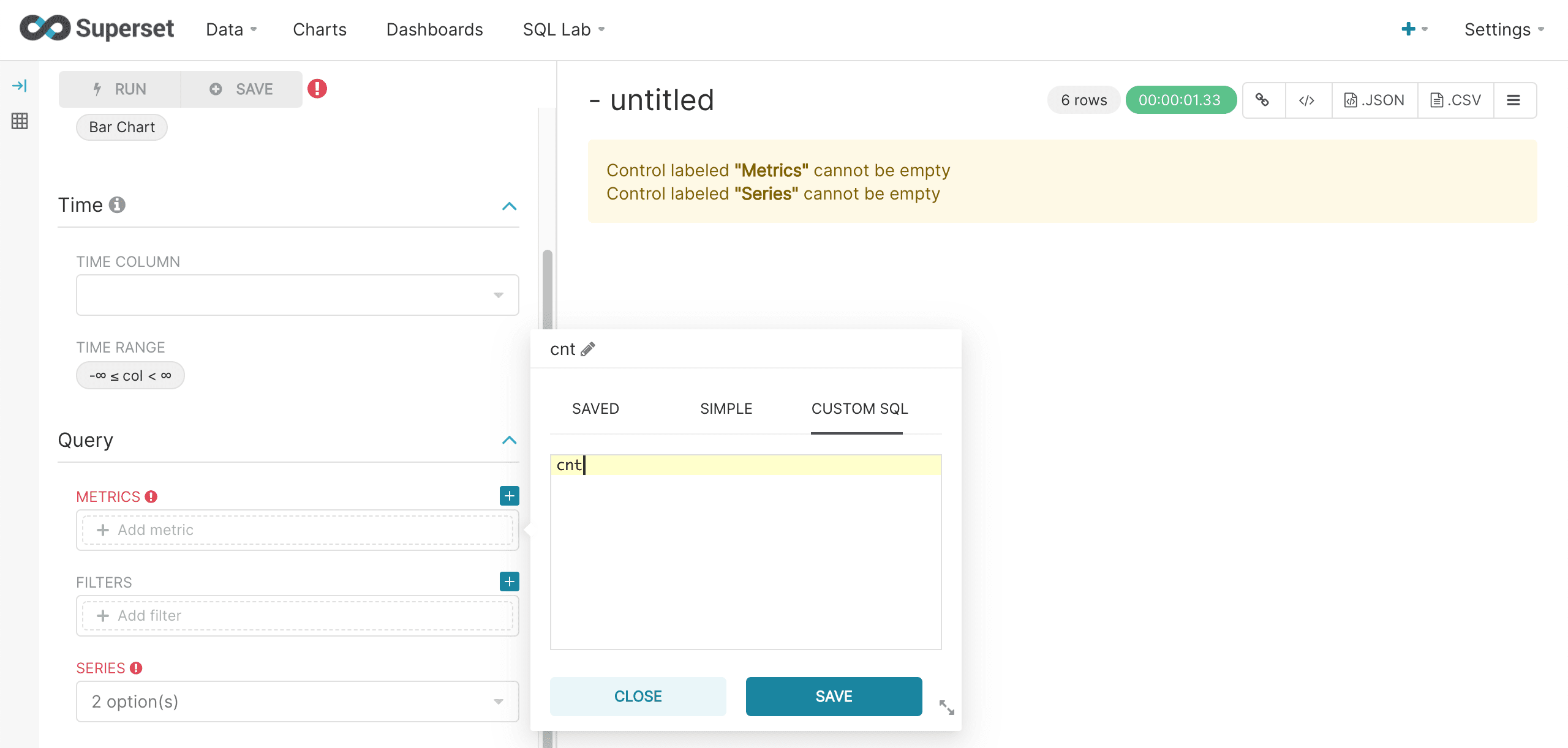
Next we’ll choose the group by field, borough_s, as the Series and run the query. The bar chart for our custom SQL query then renders in the right panel as normal.
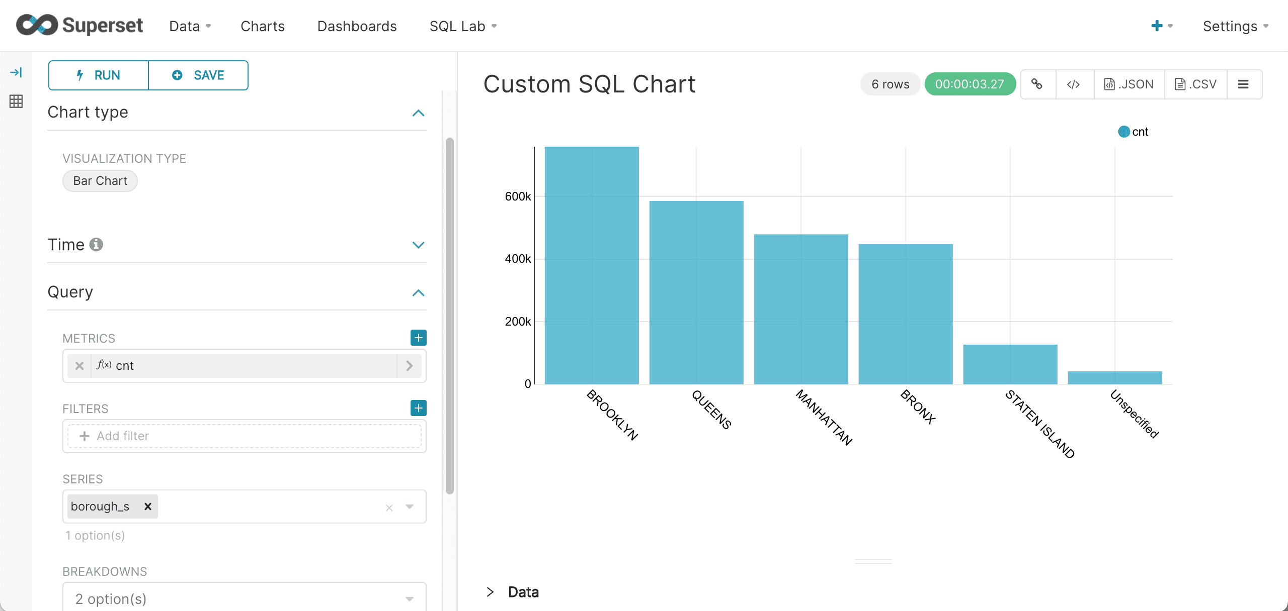
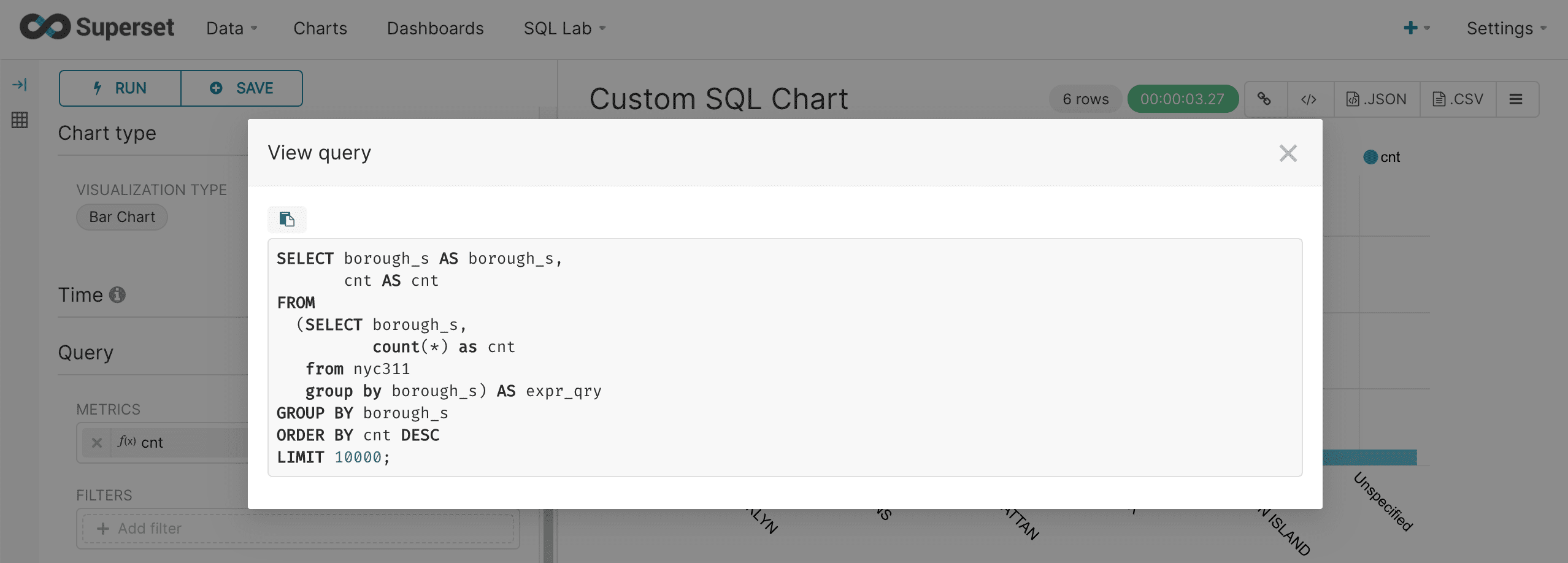
We can view the query using the same approach we used for regular charts.

This will show how Superset interacts with the custom query to render the chart.
Time series aggregations
Both Fusion SQL and Superset have powerful time series capabilities. This section describes both the Fusion SQL time series syntax and the Superset visualization.
Basic time series query
Fusion SQL supports high performance and flexible time series aggregation by grouping over the date_format function. The date_format function takes two parameters:
-
The date/time field
-
The format and interval gap. The format is specified using Java SimpleDateFormat templates. The interval gap is specified by using Solr date math syntax.
The example below shows an example of a basic time series query run inside of the Superset SQL Lab:
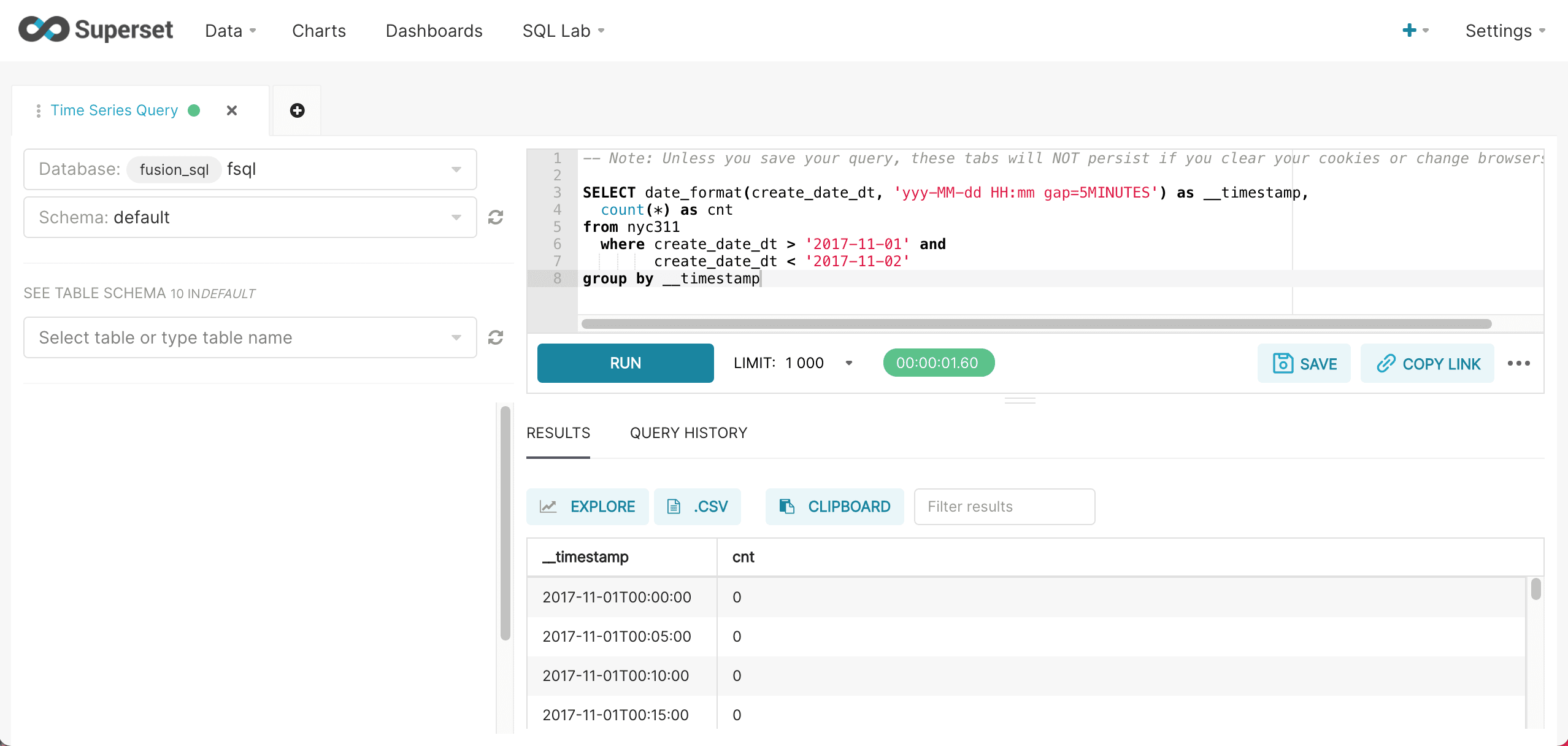
The format yyyy-MM-dd specifies that this is a daily time series. The alias __timestamp is required for the integration with Superset’s time series visualization.
Once the results return we visualize by clicking on the Explore icon and selecting a Line Chart.
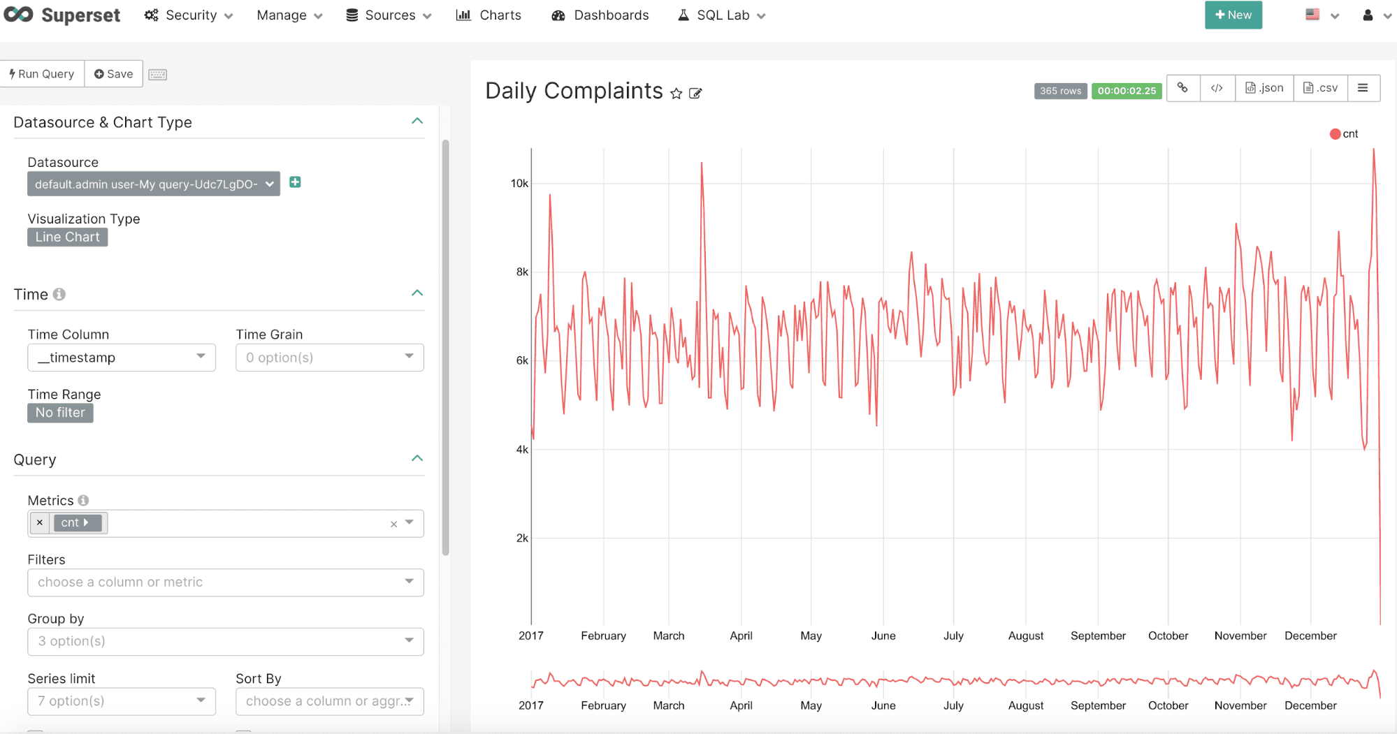
The Line Chart configuration is very basic because the SQL query defines all of the query filters and other details.
The screen below shows the configuration:
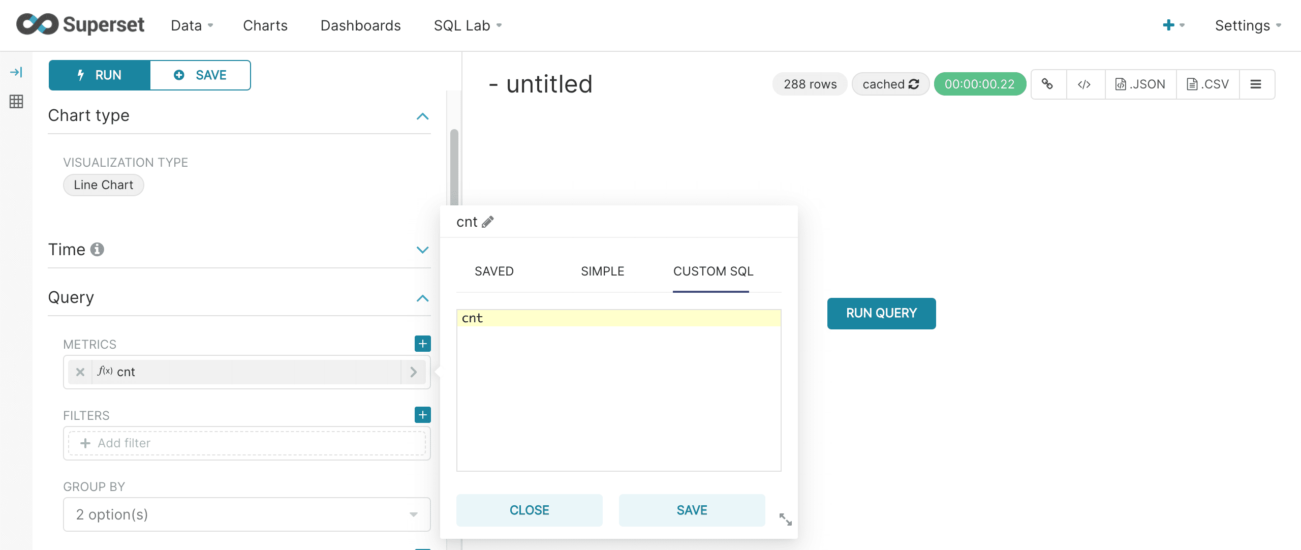
A couple of things to note about the configuration:
-
The Time filter should be turned off. Time filters need to be applied in the SQL query.
-
The time column will automatically populate with
__timestampfield in the result set. -
The metric should be set to the
cntfield. Use the Custom SQL and remove the parentheses to use the value in thecntfield without an aggregation applied to it.
After running the query the chart will render as a time series:
Interval gap
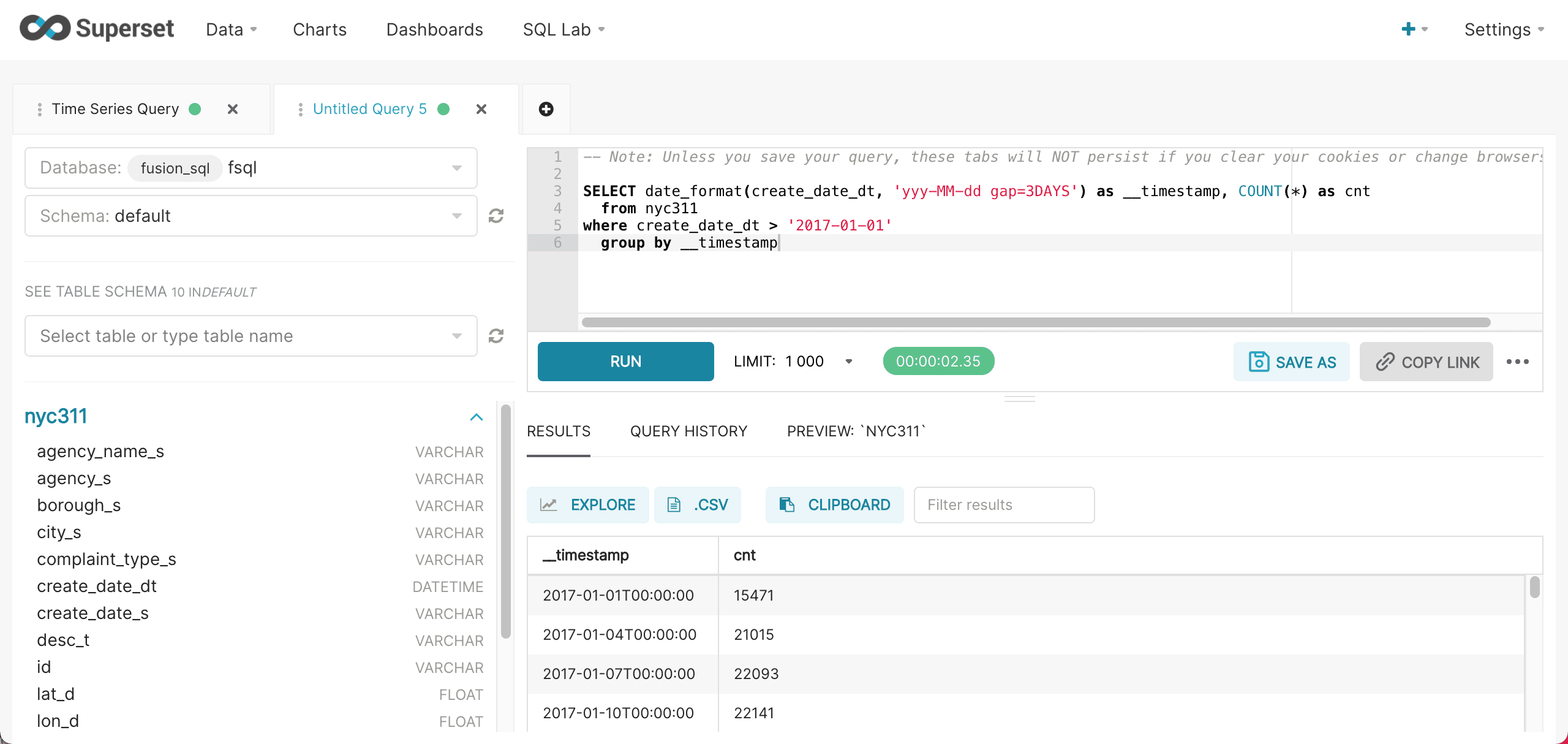
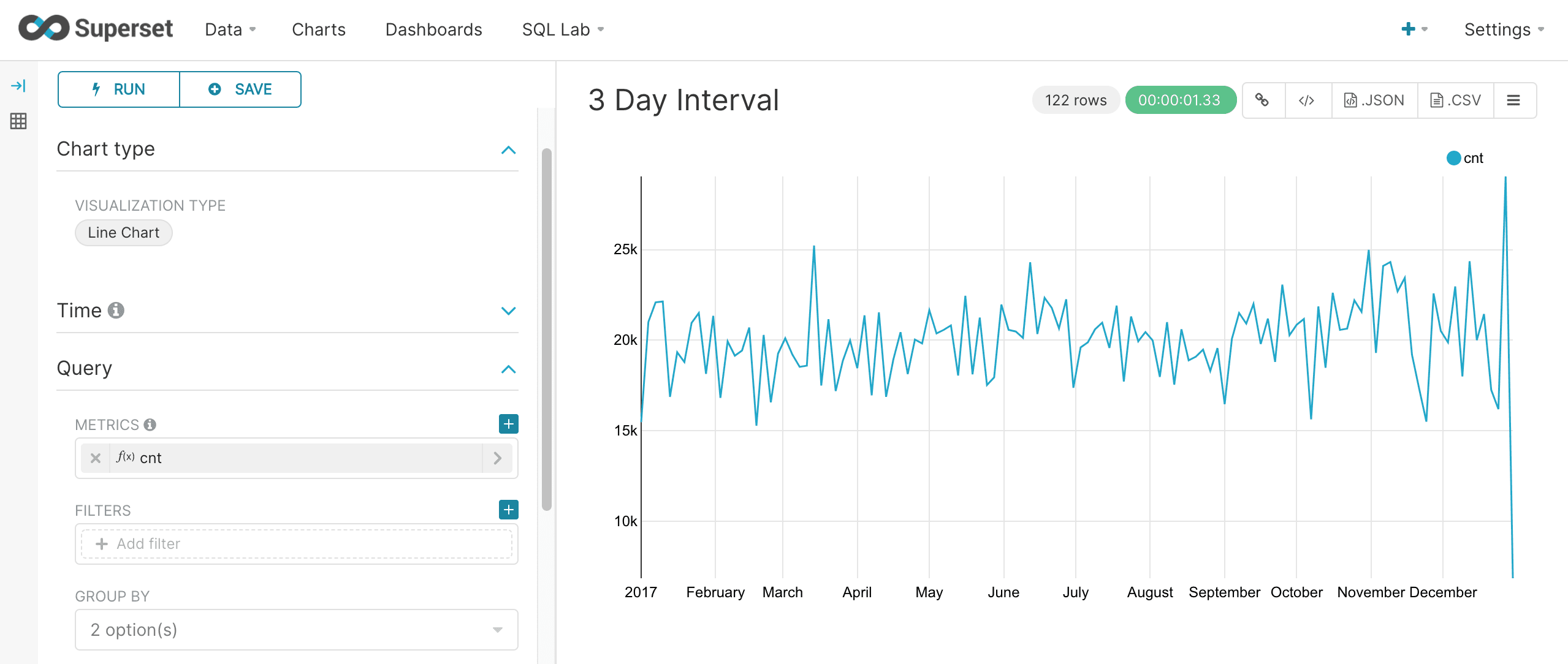
The gap parameter can be supplied along with the format to specify the gap interval. The example below specifies a 3 day gap.
Finer grain queries
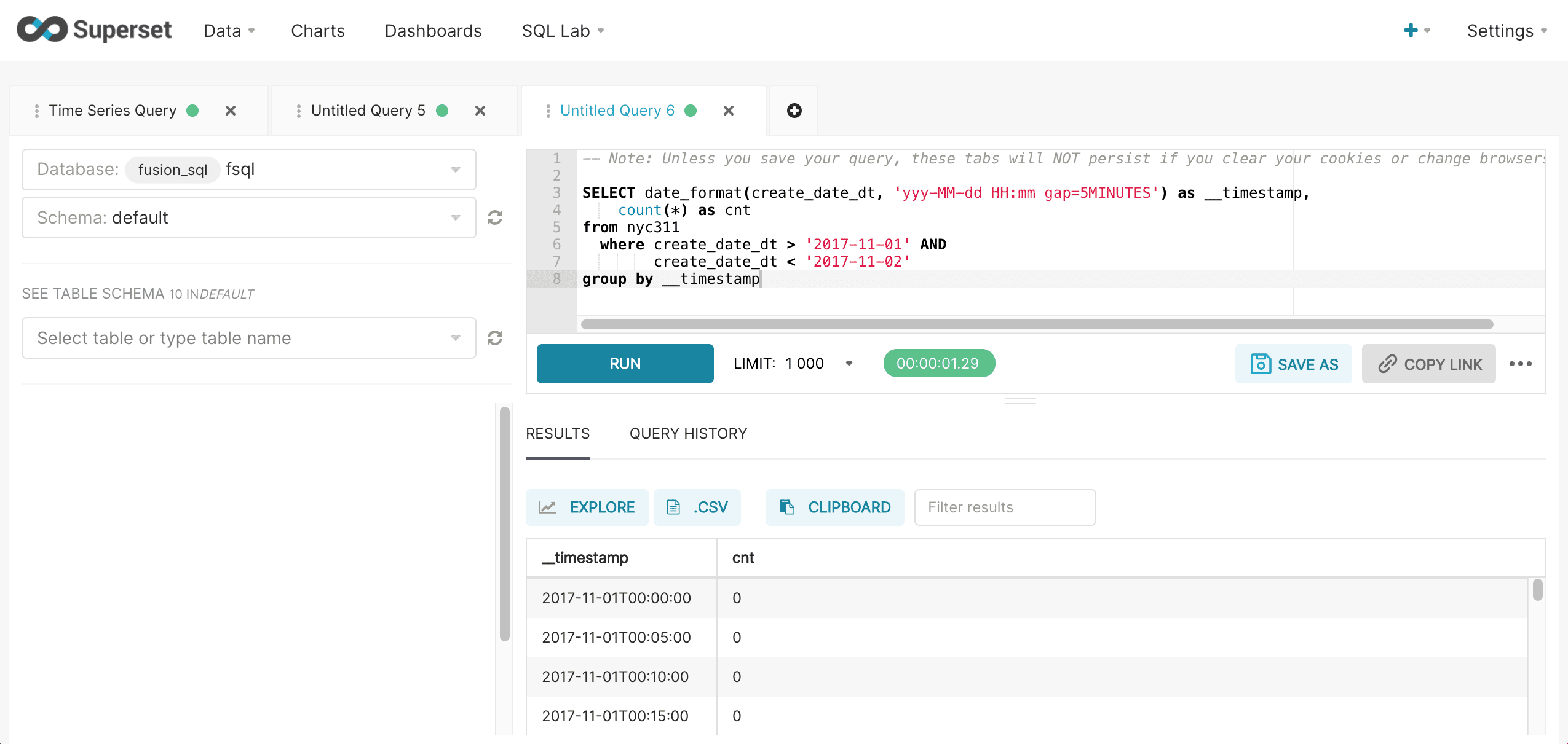
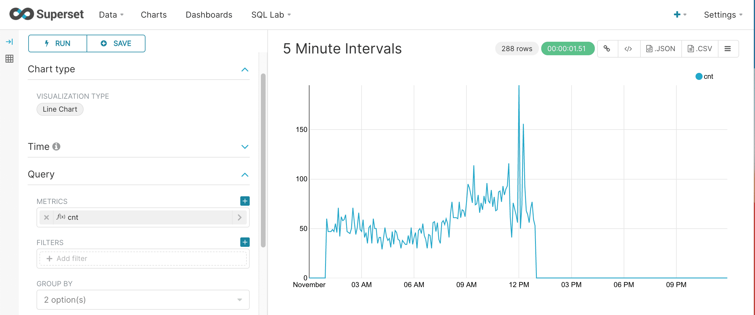
Finer time grains can be defined by adding hours, minute or seconds to the time format. The example below shows the format and gap for a 5 minute interval time series.
Fusion SQL statistical functions
Fusion SQL includes a library of statistical and machine learning functions. The section below describes a subset of these functions and how they can be used within Superset.
hist
Fusion SQL supports the hist function which pushes the histogram down into server so the full result set doesn’t need to be brought over to Superset. This allows for much larger sample sizes to be used for the histogram creation.
The hist function takes three parameters:
-
The numeric field to create the histogram from
-
The number of bins
-
The size of the random sample to create the histogram from
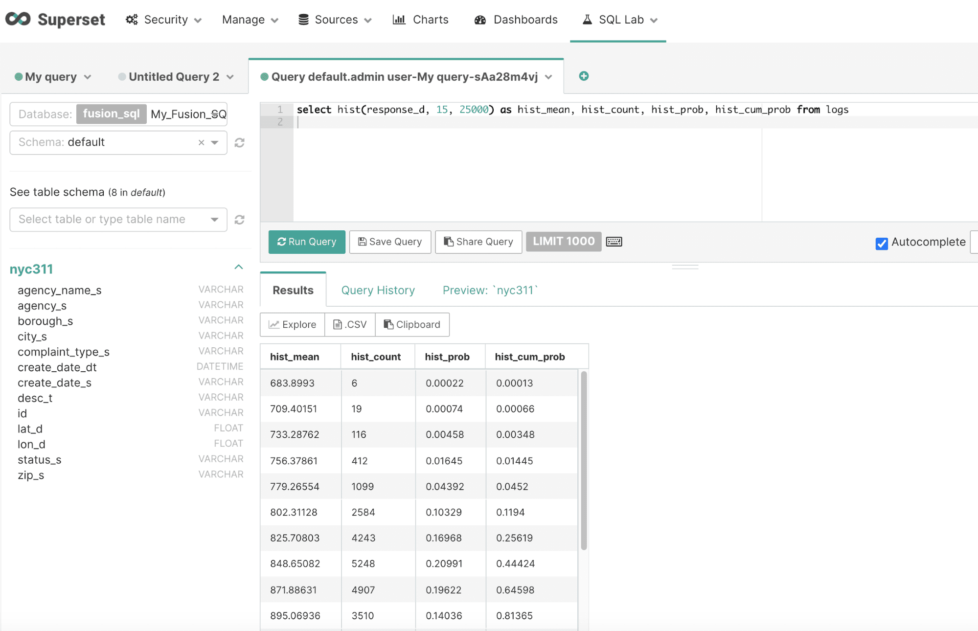
The result will contain a row for each bin in the histogram. The hist function returns the mean of each bin in the histogram. There are three other fields that can be selected when the hist function is used:
-
hist_count: The number of samples in the bin -
hist_prob: The probability of sample falling within the bin -
hist_cum_prob: The cumulative probability of each bin
Below is an example of the hist function run in the SQL Lab:
Clicking Explore brings up the chart creation screen.
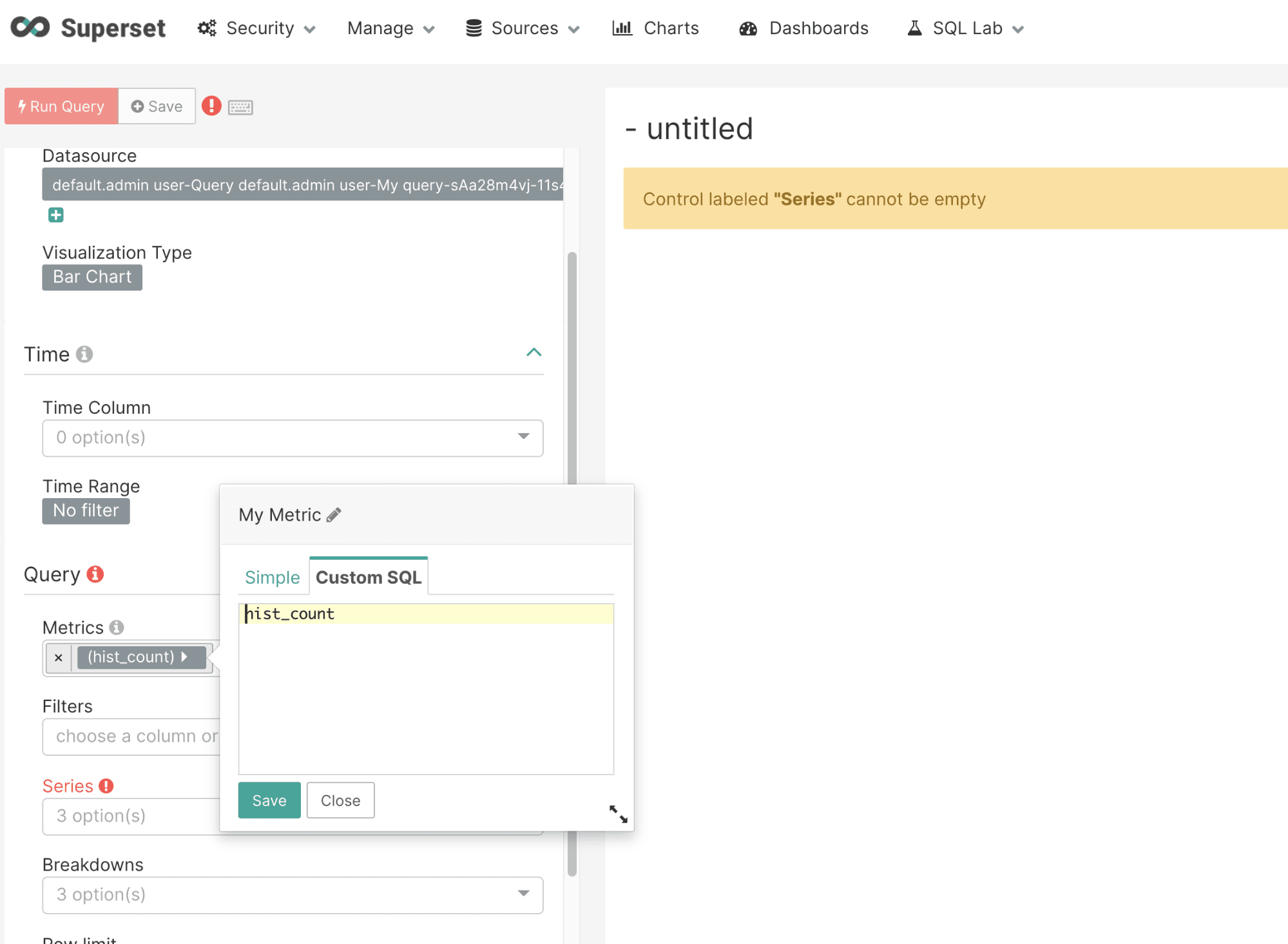
Choose a Bar Chart and select hist_count as the metric. This will use the hist_count for the y-axis. Be sure to remove the parentheses using the Custom SQL panel shown below:
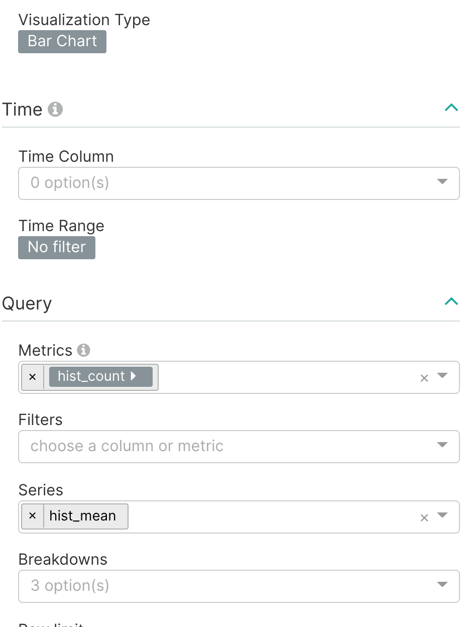
Next select the hist_mean as the Series as shown below:
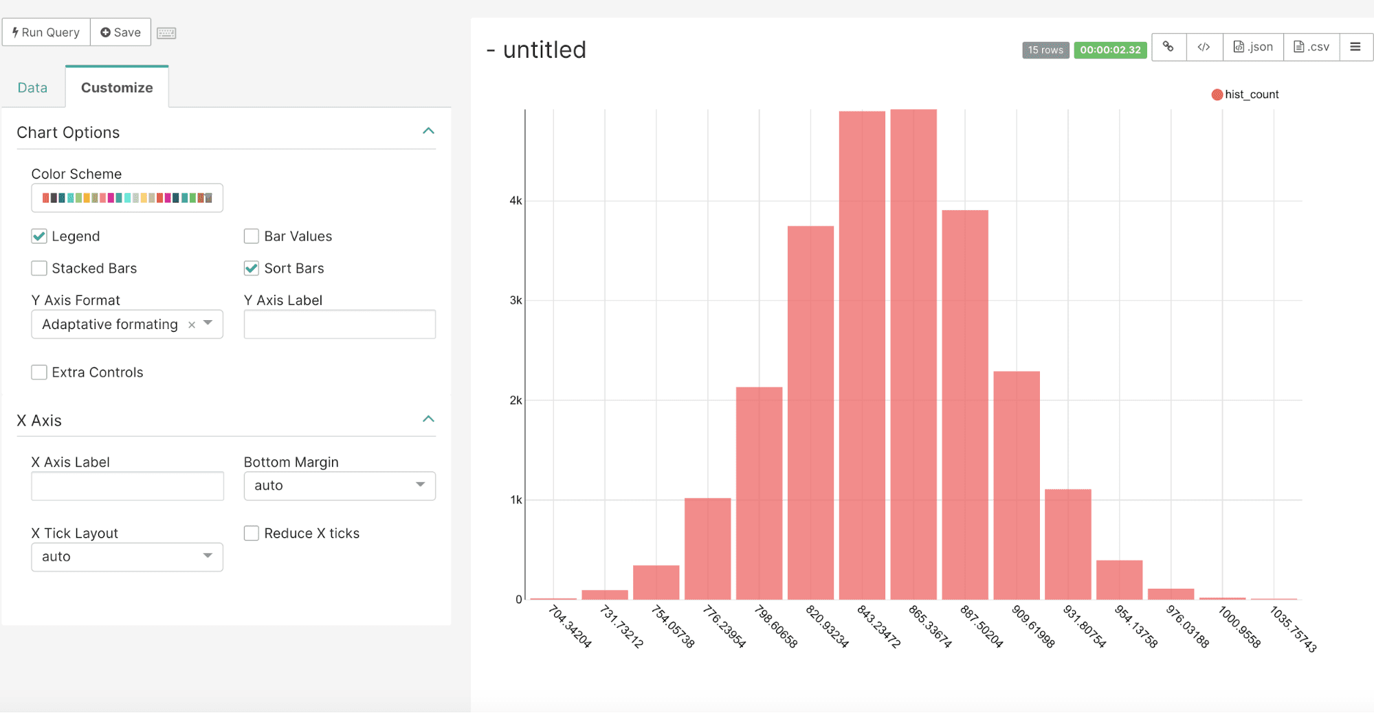
By default the bar chart will sort the bars in descending order. To maintain the original order of the bar chart go to the Customize tab and check the Sort Bars box. This will display the histogram bars in the order of the result set as shown below:
geo_cluster
We saw in the section on Mapping that it was very easy to plot lat/lon points on a map with Superset’s deck.gl.Scatterplot visualization. Fusion SQL can identify the clusters in these scatter plots with the geo_cluster function. The geo_cluster function performs geo_spatial clustering and noise reduction over a set of lat/lon points. Under the covers the geo_cluster function uses DBSCAN clustering using the haversine meters distance measure.
The geo-cluster function allows you to specify the criteria that define a cluster. Any points that don’t meet the criteria will be filtered from the result set. This filtering provides powerful noise reduction which can help to visualize the clusters on a map.
The geo_cluster function takes four parameters:
-
The latitude column in the index
-
The longitude column in the index
-
The distance in meters between points for points to be considered a cluster
-
The smallest number of points to be considered a cluster
The geo_cluster function returns the cluster ID for each point in the result set. The latitude and longitude fields can also be selected with each point.
Below is an example of the geo_cluster function run inside of the SQL Lab:
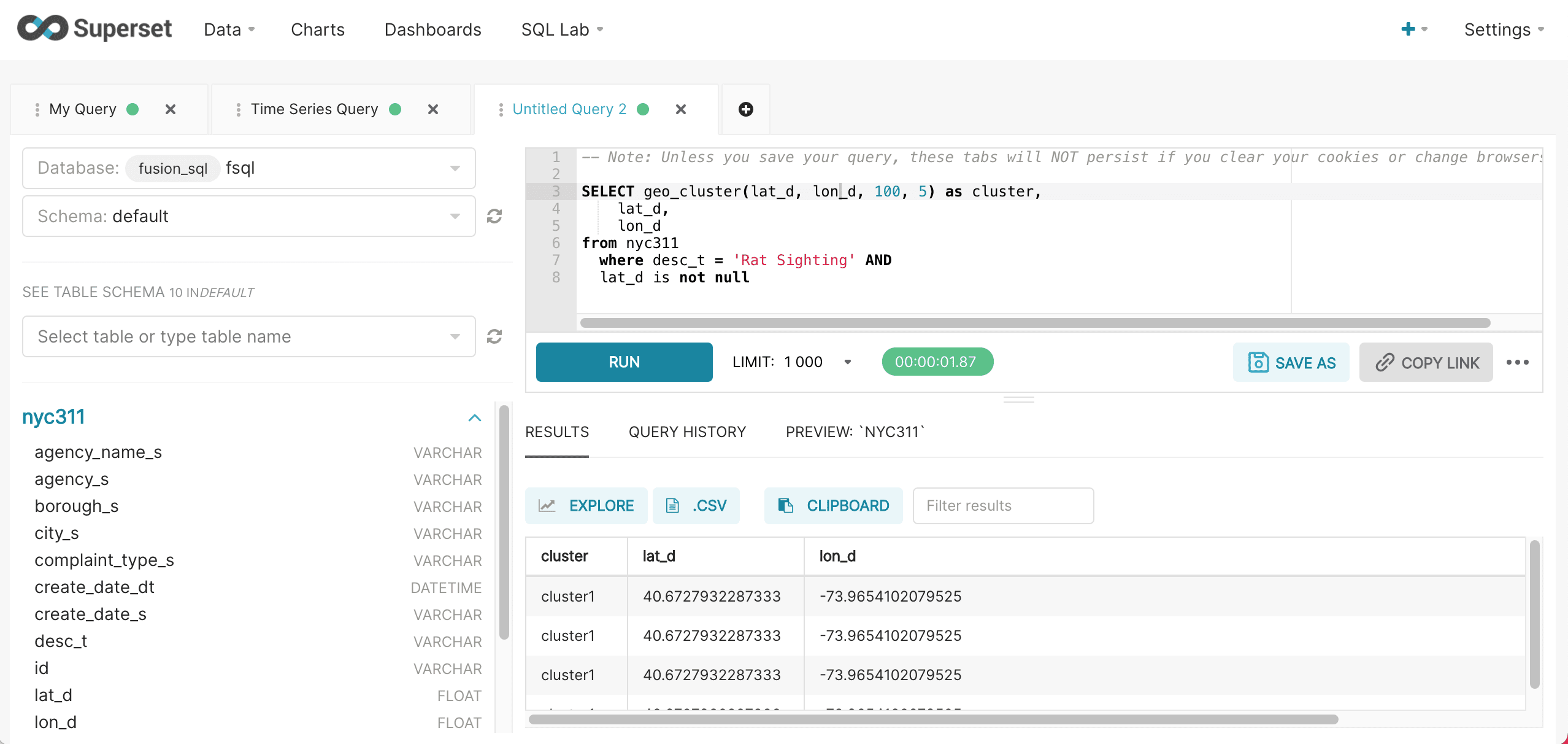
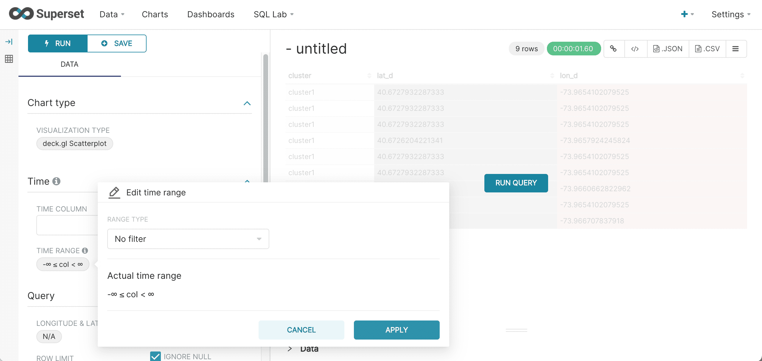
After the results are displayed, click Explore to start visualizing the results. The first steps in visualizing is to select the deck.gl.Scatterplot visualization and turn off the Time Range filter as shown below:
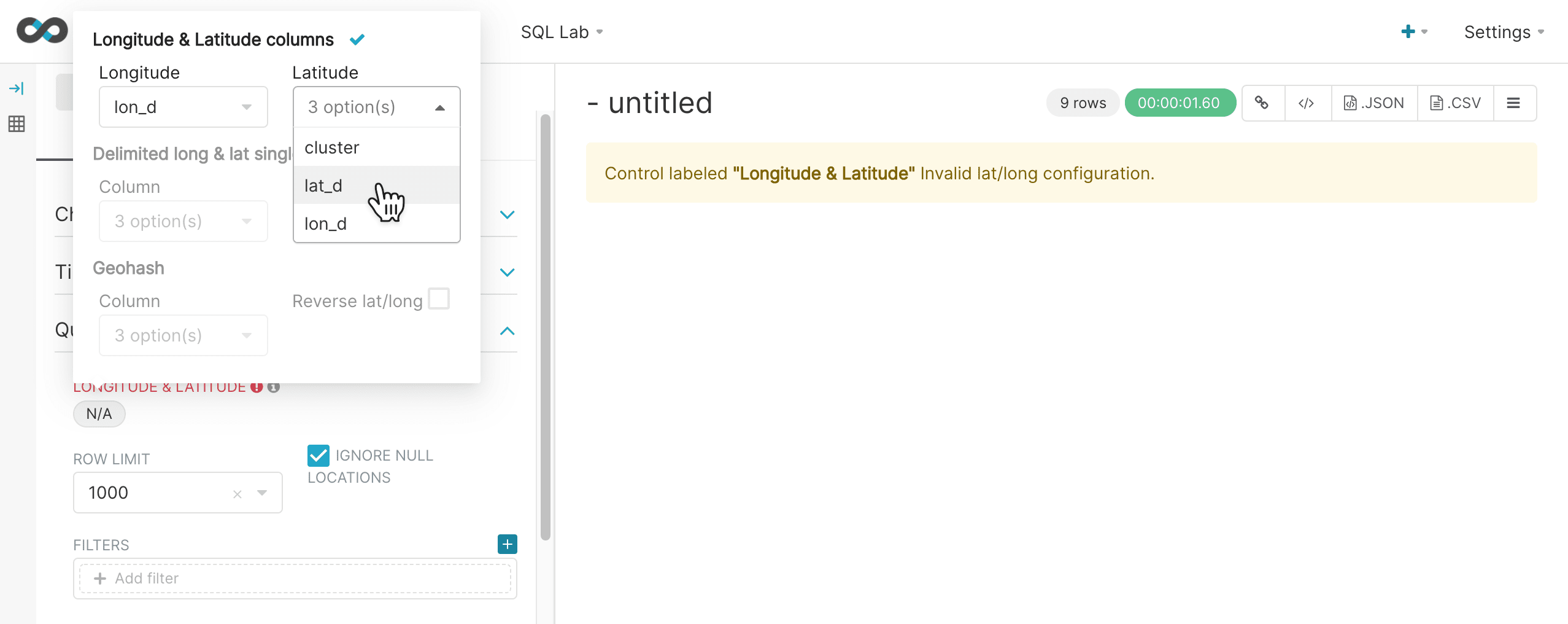
Next you can configure the longitude and latitude columns and choose the row limit. The row limit will control the number of points that are selected for clustering.
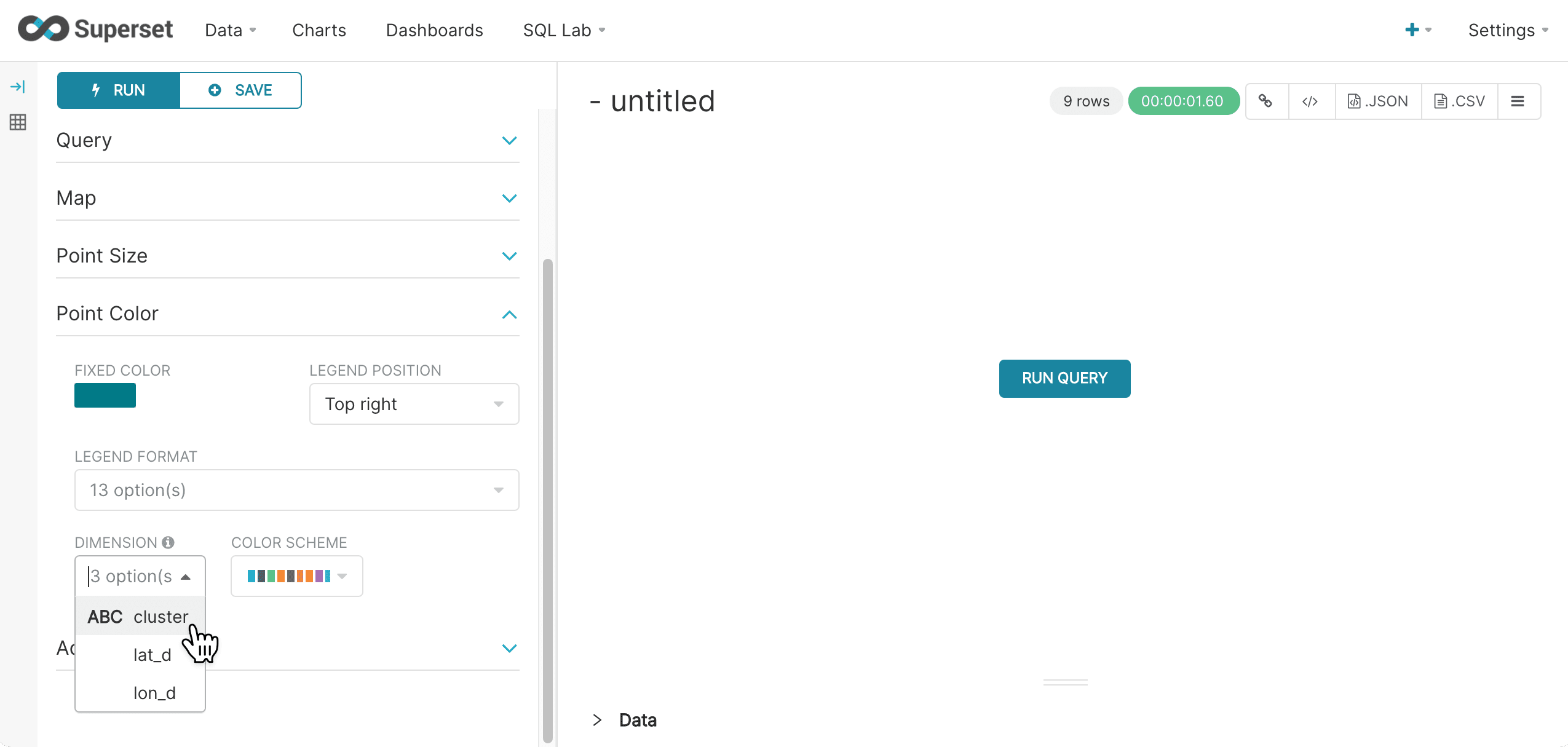
Then in the Point Color section select the cluster column under the Categorical Color icon. This will color code the points based on cluster ID.
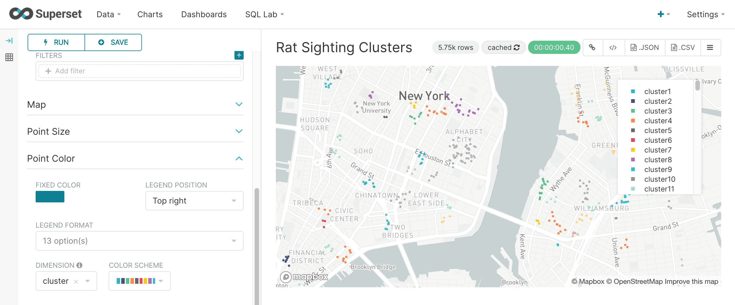
When you run the query the map will render, displaying only the points that belong to a cluster. The example below shows the color coded clusters on the map:
significant_terms
The significant_terms function finds anomaly terms in a text or string field that appear more frequently in a search result set than the entire index.
The significant_terms function takes four parameters:
-
the string or text field in which to find the terms.
-
the minimum term length to be considered a significant term.
-
the minimum document frequency for a term to be considered a significant term. If greater than one this value is treated as an absolute number of documents. If the value is a float between 0 and 1 its considered to be a percentage of total documents.
-
the maximum document frequency for a term to be considered a significant term. If greater than one this value is treated as an absolute number of documents. If the value is a float between 0 and 1 its considered to be a percentage of total documents.
The result set for the significant_terms function contains one row for each significant term. The significant_terms function returns the value of the term. There are three additional fields available when the significant_terms function is used:
-
The foreground field returns the number of documents that contain the term within the result set.
-
The background field returns the number of documents that contain the term in the entire index.
-
The score field returns the score for the field which is calculated based on the background and foreground counts. Terms are returned in score descending order.
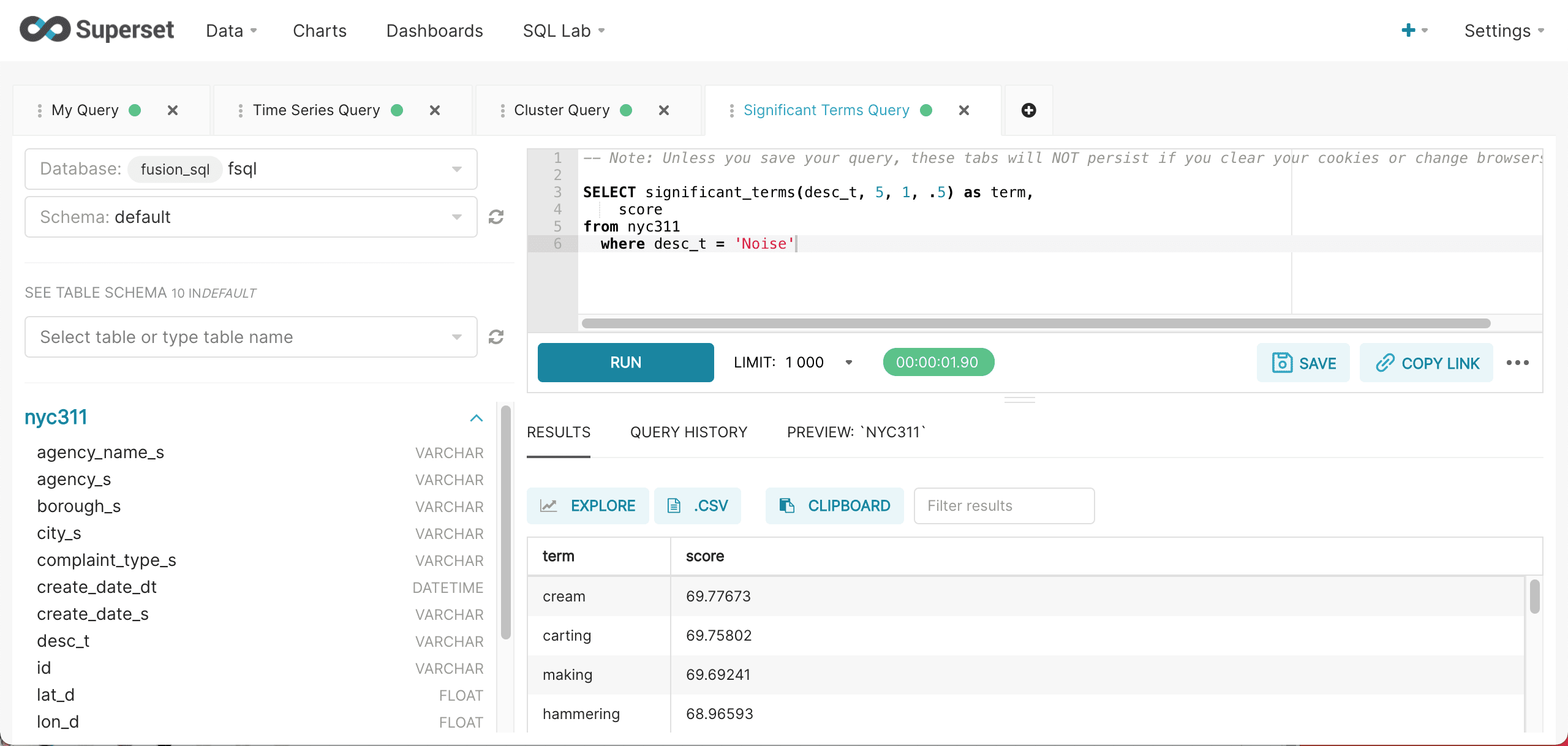
Below is an example of the significant_terms query run inside of SQL Lab.
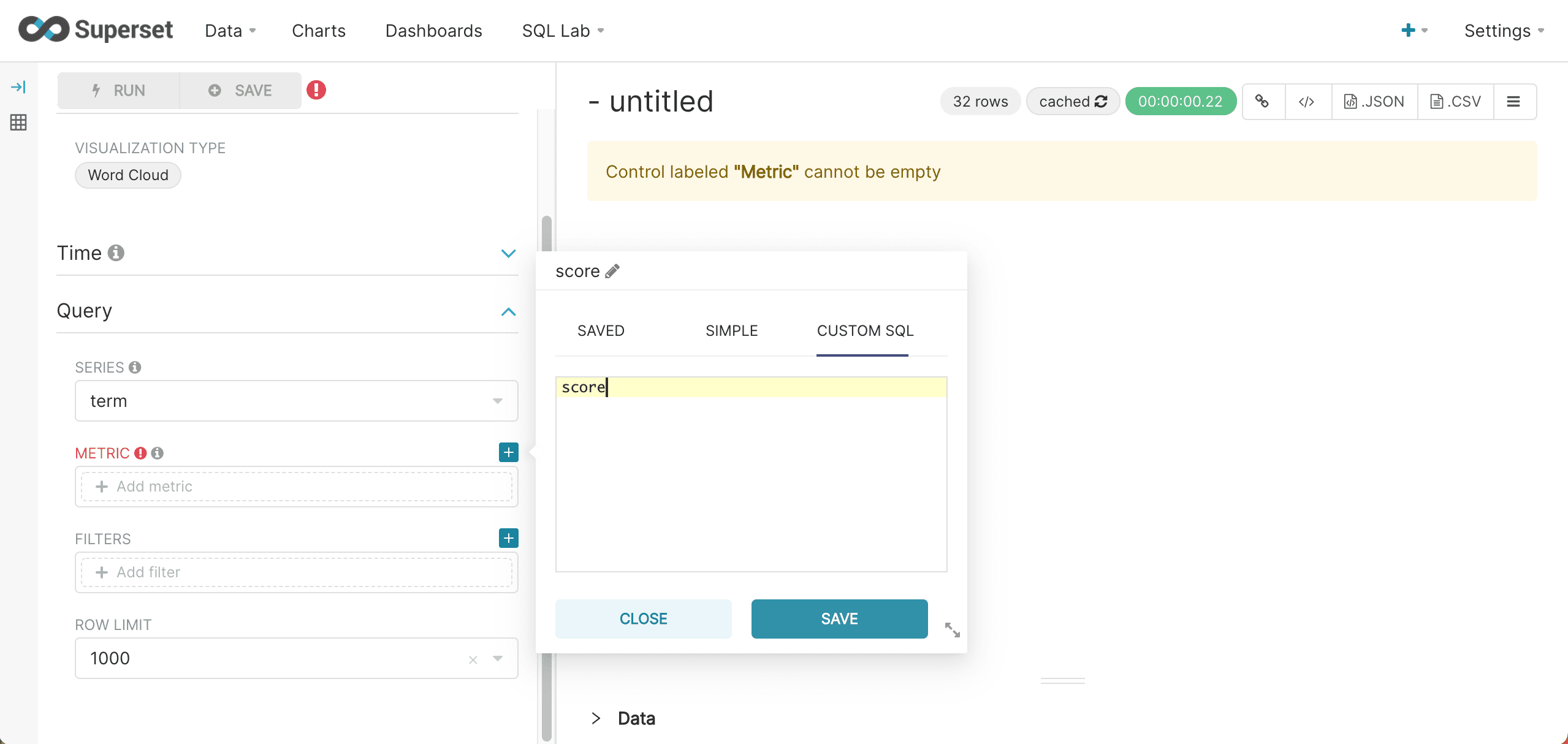
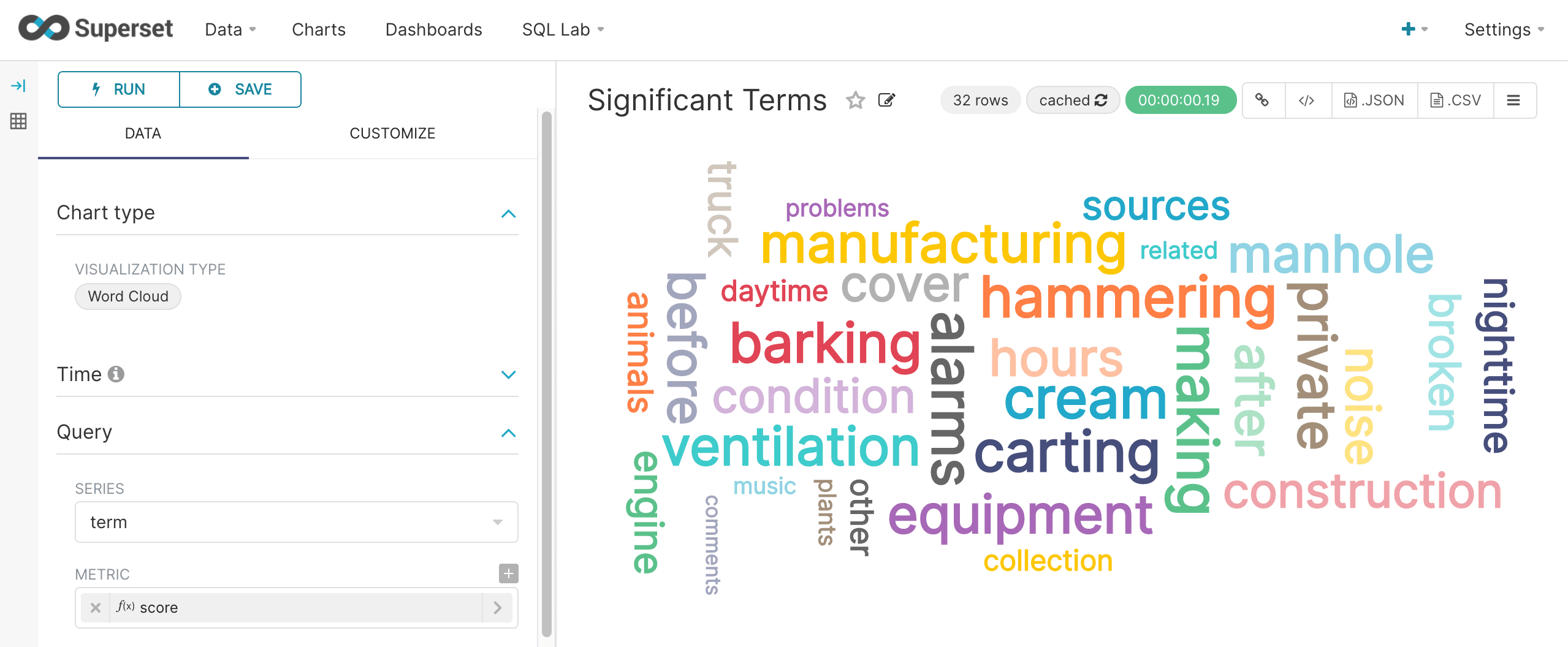
After the results have been displayed they can be visualized by clicking Explore and selecting the Word Cloud visualization. The word cloud visualization can be configured by selecting term in the Series drop down box and score as the Metric. Be sure to choose Custom SQL and remove the parentheses from the score so that an aggregation is not applied to the score. This configuration step is shown below:
Once the Word Cloud is configured, run the query to see the word cloud rendered like the screenshot below:
analyze
The analyze function analyzes a text or string field with a Lucene/Solr analyzer and returns the analyzed tokens. The use of Lucene/Solr analyzers at query time allows for real-time entity extraction by configuring OpenNLP, Stanford NLP or other NLP analyzers.
The analyze function takes three parameters:
-
the text or string field to analyze
-
a string literal pointer to the Lucene/Solr analyzer to use. This can be either a field name in the Solr schema with an analyzer defined, or a string that matches a dynamic field pattern.
-
the number of documents to analyze
Which documents are analyzed is determined by the WHERE clause. The documents are ordered by score descending to determine the top N documents to analyze.
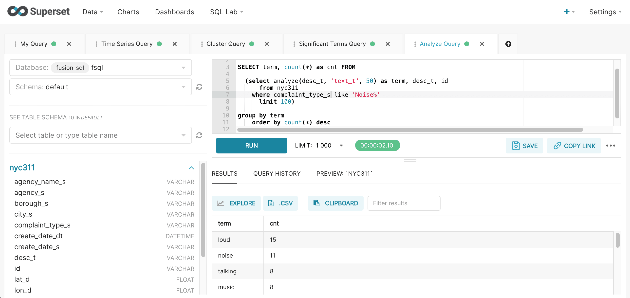
A SQL aggregation query can be wrapped around the analyzed result set to perform aggregation over the terms. Below is an example of the wrapped aggregation query run inside of SQL Lab:
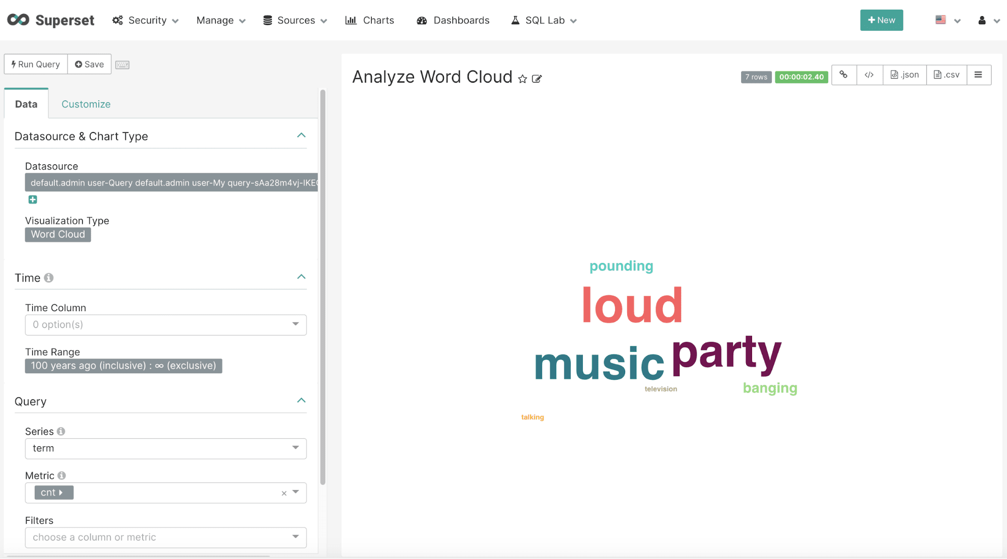
After the results have been displayed they can be visualized by clicking on the Explore icon and choosing the Word Cloud visualization. The word cloud visualization can be configured by selecting term in the Series drop down box and cnt as the Metric. Be sure to choose Custom SQL and remove the parentheses from the cnt so that an aggregation is not applied to the score. This configuration step is shown below:
corr_matrix
Correlation matrices can be computed using the corr_matrix function. The corr_matrix function takes two parameters:
-
A string, enclosed in single quotes, containing a comma-separated list of numeric fields for which to calculate the matrix.
-
The sample size to compute the correlation matrix from.
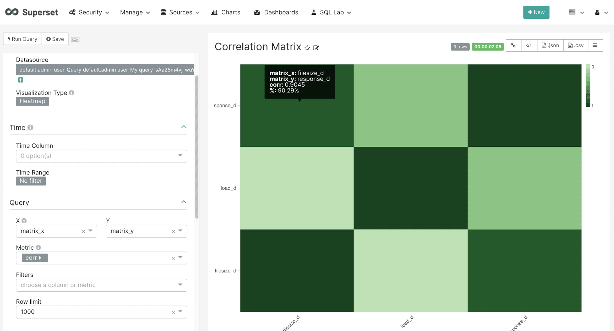
The result set for the corr_matrix function contains one row for each two field combination listed in the first parameter. The corr_matrix function returns the correlation for the two field combination. There are two additional fields, matrix_x and matrix_y that contain the values for the field combination for the row.
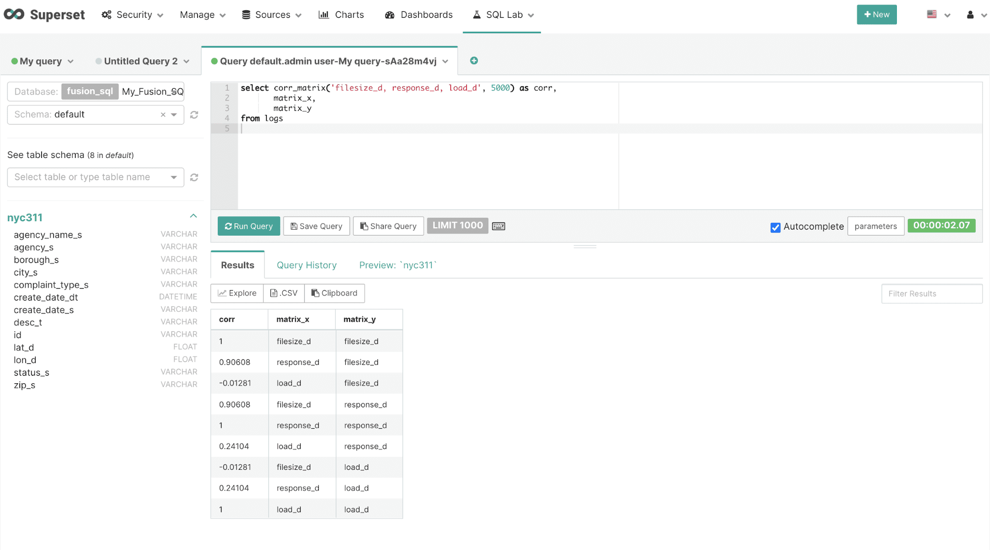
After the results have been displayed they can be visualized by clicking on the Explore icon.
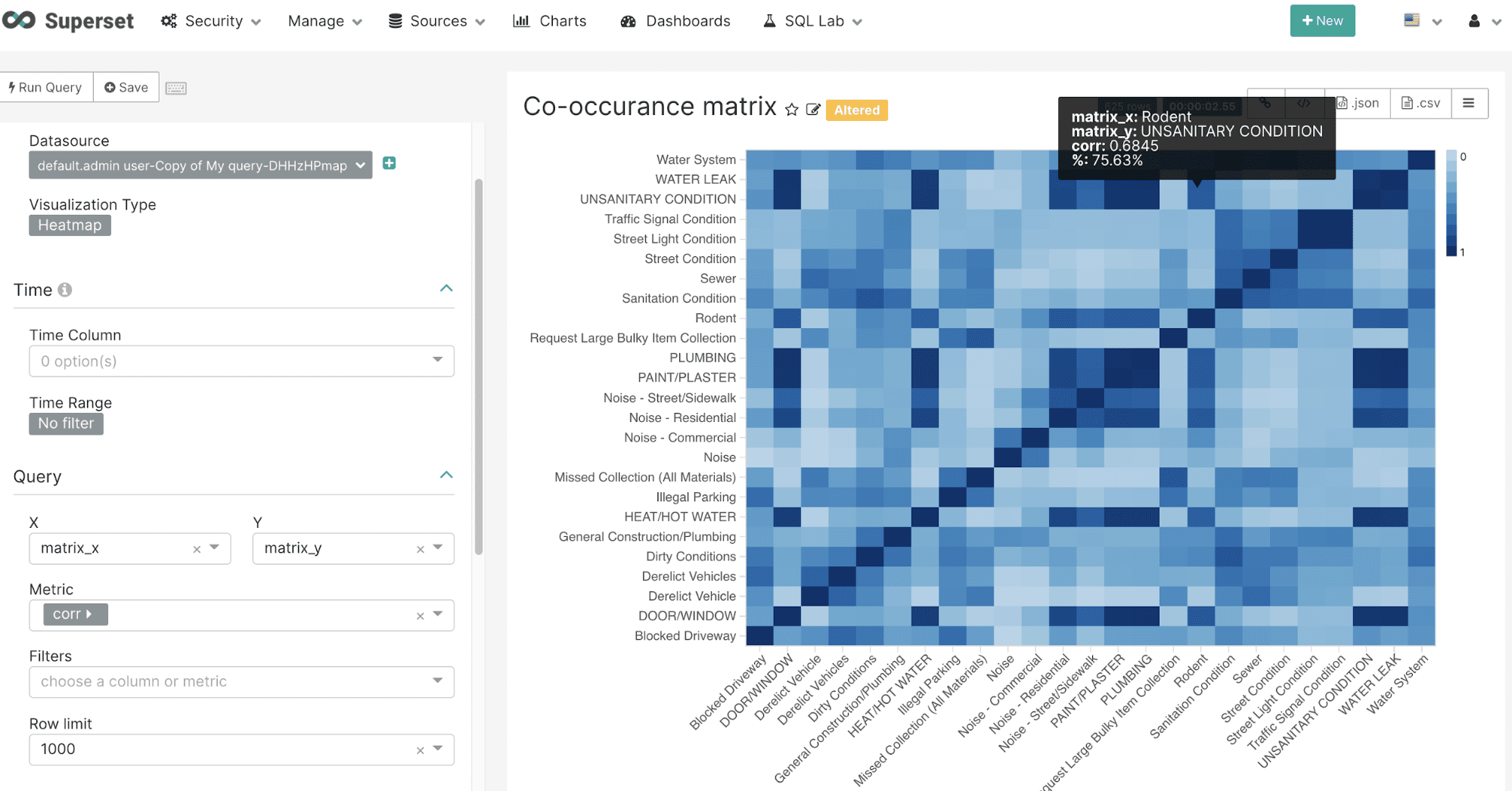
Once on the chart creation screen select the Heatmap visualization. The heatmap can be easily configured by selecting the matrix_x field in the X dropdown and the matrix_y field in the Y dropdown. In the Metric dropdown select the corr field which holds the correlation value for each X/Y combination. Be sure to use the Custom SQL tab and remove the parentheses from the corr field name so an aggregation is not applied to the corr value.
The example below shows the configuration and heatmap visualization for the corr_matrix function:
co_matrix
The co_matrix function returns a matrix that shows the correlation of values within a categorical field based on their co-occurrence across a different categorical field. For example in a medical database this could be used to correlate diseases by co-occurring symptoms. In the example below the co_matrix function is used to correlate complaint types across zip codes in the NYC 311 complaint database. This can be used to better understand how complaint types are correlated across zip codes. The co_matrix function has 4 parameters:
-
The categorical String field that will be correlated.
-
The categorical String field that will be used for co-occurrence.
-
The number of categorical variables to correlate.
-
The number of categorical variables to calculate co-occurrence from.
The result set for the co_matrix function is a correlation matrix for the first categorical field parameter. The co_matrix function returns the correlation for each row. The matrix_x and matrix_y fields contain the combinations of the top N categorical values.
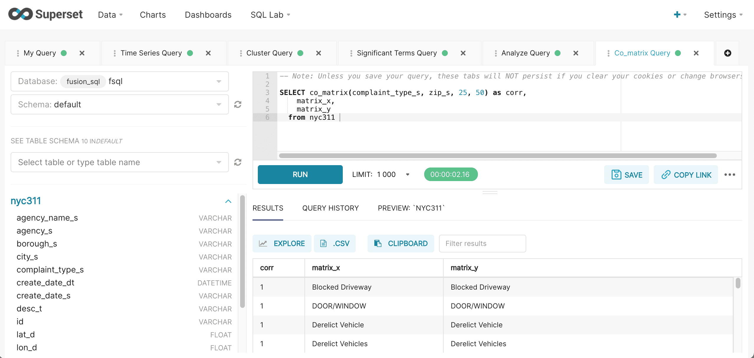
After the results have been displayed they can be visualized by clicking on the Explore icon.
Once on the chart creation screen select the Heatmap visualization. The heatmap can be configured by selecting the matrix_x field in the X dropdown and the matrix_y field in the Y dropdown. In the Metric dropdown select corr return field which holds the correlation value for each X/Y combination. Be sure to use the Custom SQL tab and remove the parentheses from the corr field name so an aggregation is not applied to the corr value.
The example below shows the configuration and heatmap visualization for the co_matrix function:
