Use Jupyter with Fusion SQL
This guide provides basic setup steps for connecting to Fusion SQL in a Jupyter notebook, then shows examples of how to query and visualize result sets and statistical functions from Fusion SQL. The full scope of Fusion SQL query capabilities is covered in Querying Fusion SQL.
Basic setup
-
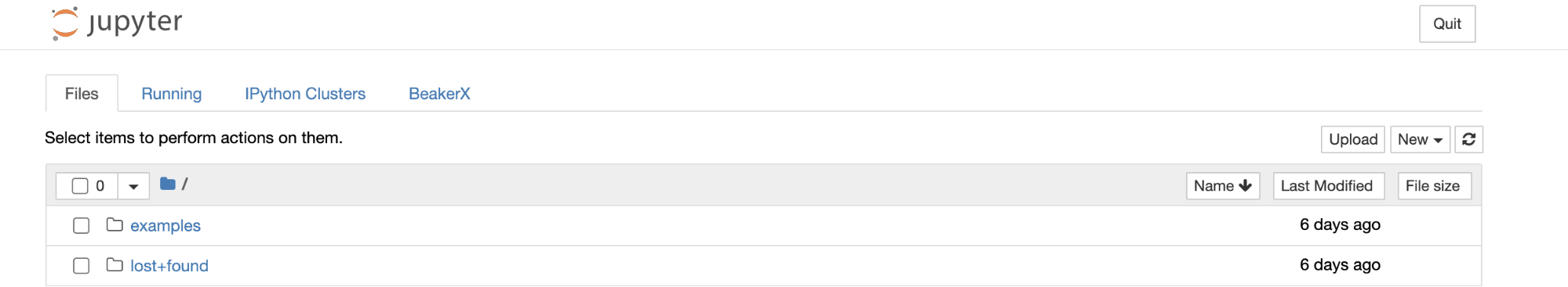
Navigate to
https://FUSION_HOST:6764/jupyterin your browser.The Jupyter home page will load in your browser:
-
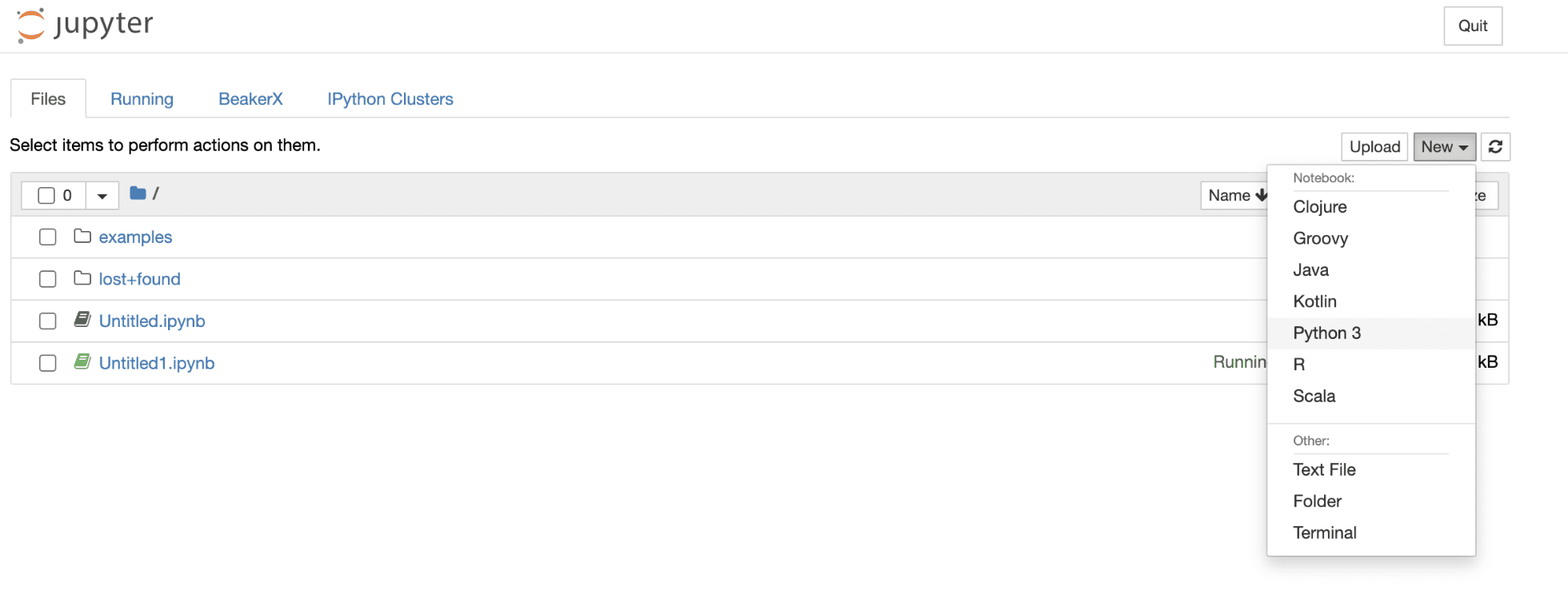
Create a new Python 3 notebook:
-
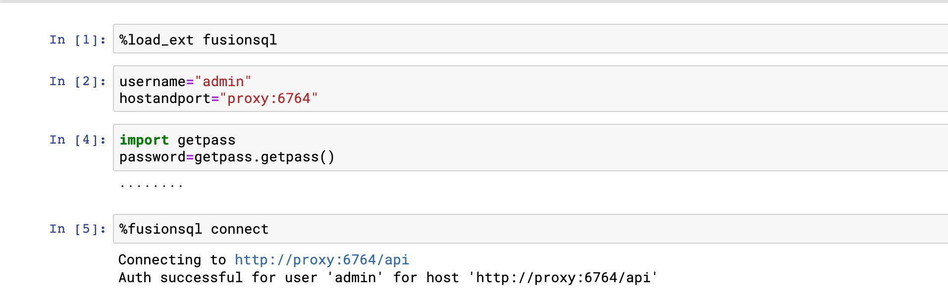
Connect to Fusion SQL through the Fusion proxy by issuing the following commands into the notebook:
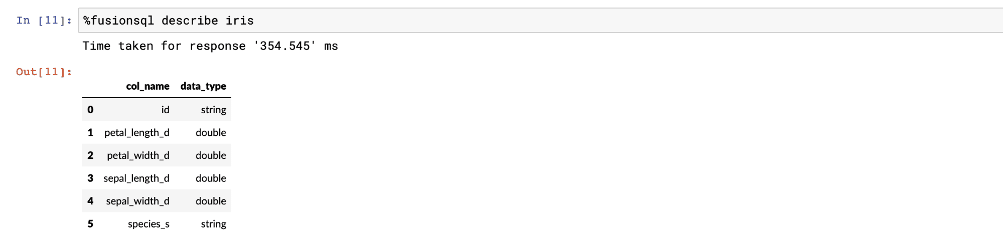
Showing and describing tables
The fusionsql Python extension is used to issue commands and SQL queries to Fusion SQL.
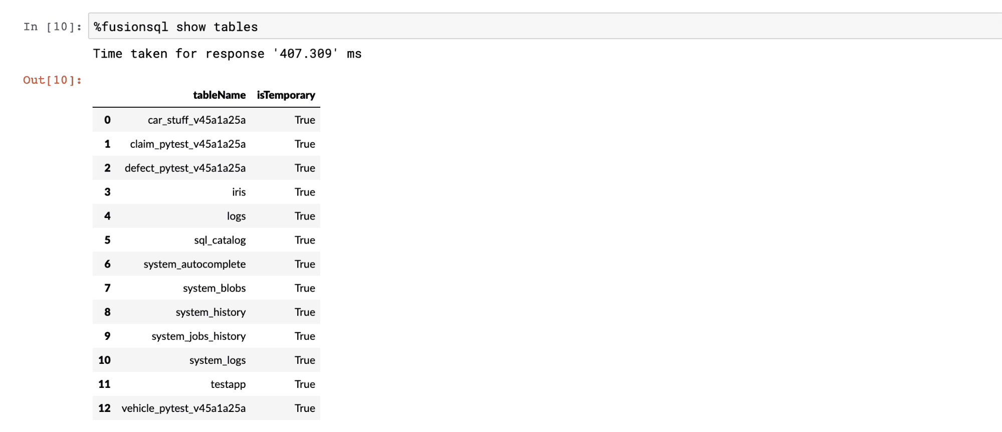
The show tables command can be used to list the available tables:
The describe tablename command can be used list the columns and data types in a table:
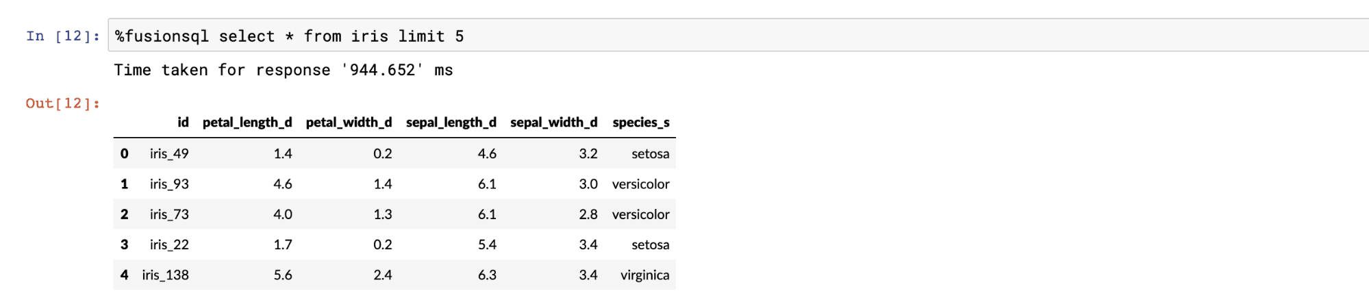
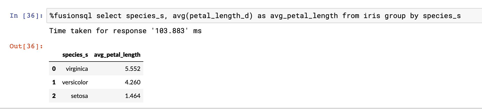
Querying with SQL
SQL is used to query the data in the tables. All SQL queries return a Pandas dataframe. If the result set is not set to a variable it is displayed in the notebook. The example below shows a SQL query and output:
Sampling and visualization
Basic select queries that do not include an order by return a random sample that matches the result set. Fusion SQL has very fast and scalable sampling capabilities. Sampled result sets can be set to variables which are Pandas dataframes. The result sets can be manipulated and visualized through standard dataframe functions.
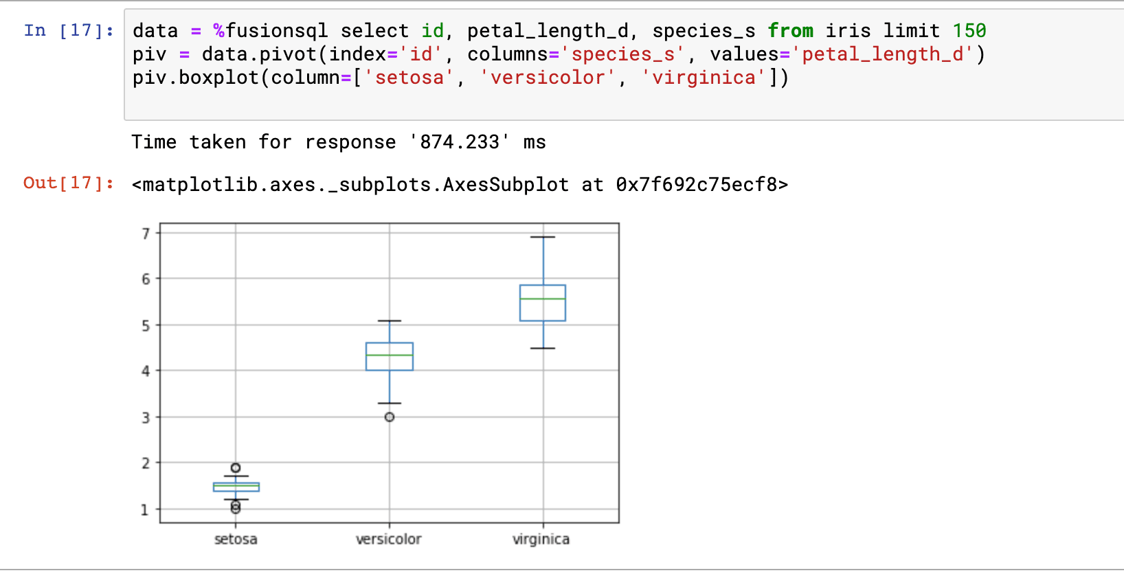
The example below issues a SQL query and sets it to the variable data, which is a Pandas dataframe. The next statement calls the boxplot function directly on the dataframe. The boxplot appears below. Boxplots allow for the quick visual comparison of the distributions within the columns in the dataframe.
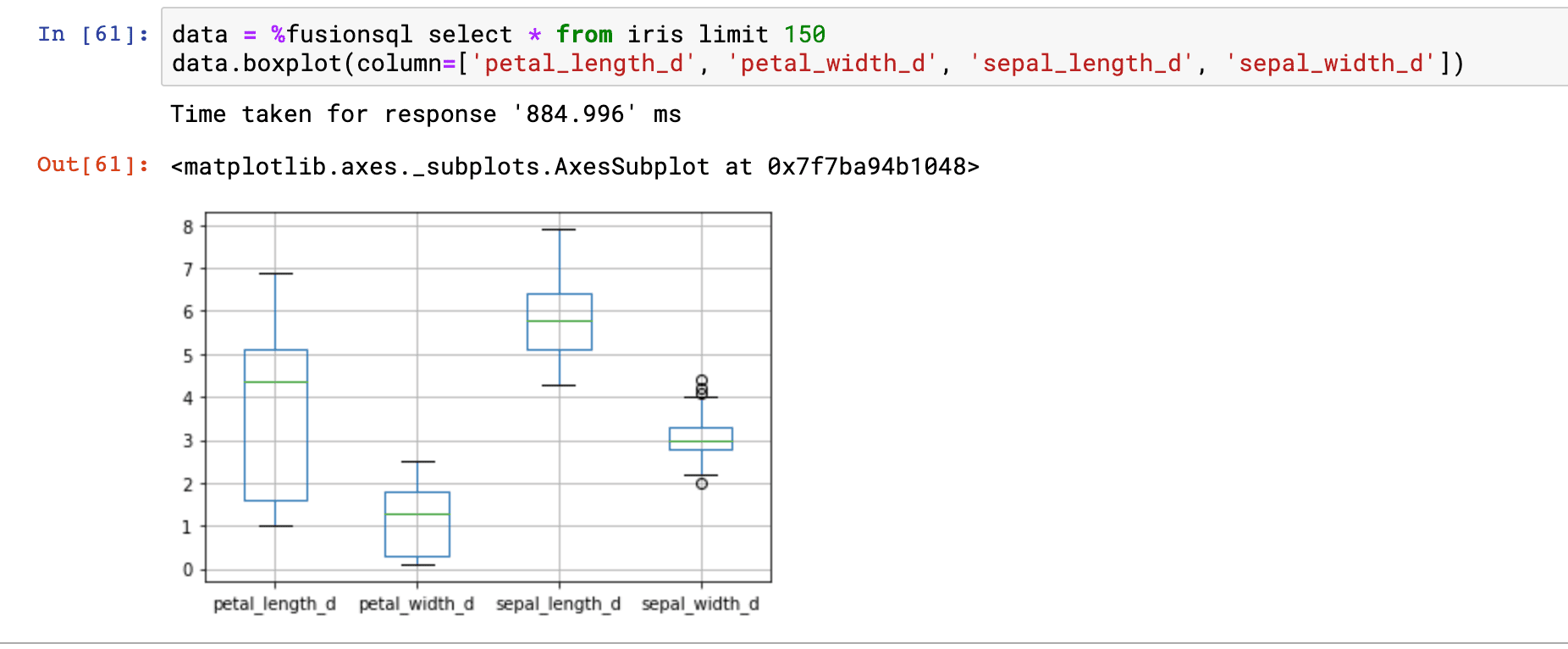
In the example above we’re comparing the distributions of the petal_length_d, petal_width_d, sepal_length_d and sepal_width_d fields.
This result set also contains a categorical field called species_s. We can change the orientation of the dataframe so that we can do a boxplot of the petal_length_d field by the species_s field. The dataframe has a pivot function which can change the orientation of the result set so that the values in the species_s field become the column headers of the dataframe. Below is an example of how to use the pivot function:
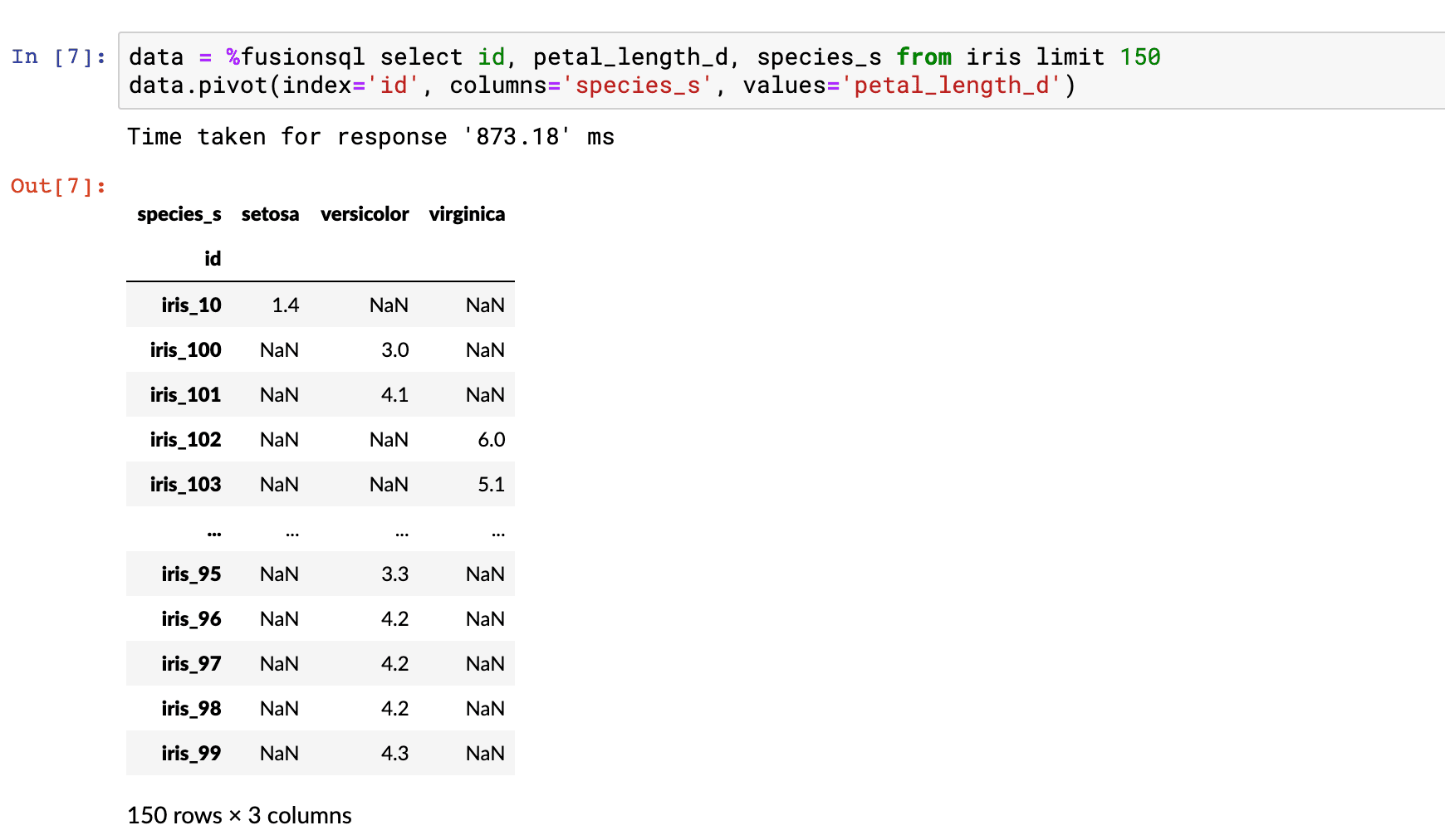
Notice that we now have a matrix with the species_s field as column headers. Each row in the table only has petal_length_d data populated for one of the species_s types.
The boxplot function conveniently ignores the NaN values to create a boxplot for each species_s column.
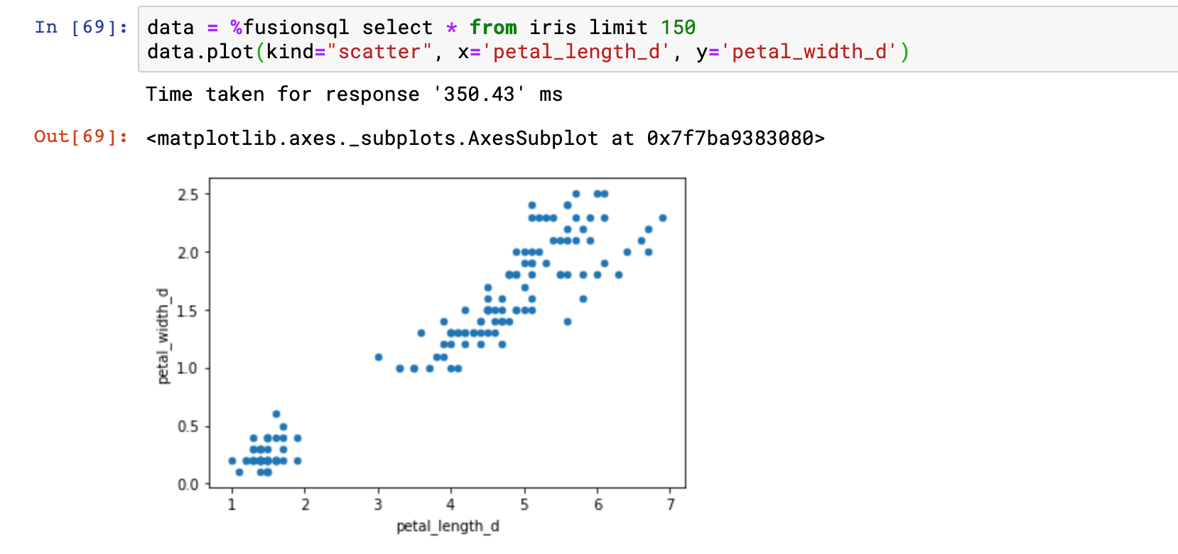
Samples can also be used to visualize the relationship between two numeric fields. The example below takes a sample and sets it to a dataframe. The dataframe plot function is then used to plot a scatter plot with petal_length_d on the x-axis and petal_width_d on the y-axis. From this plot we can quickly see how petal_length affects petal_width.
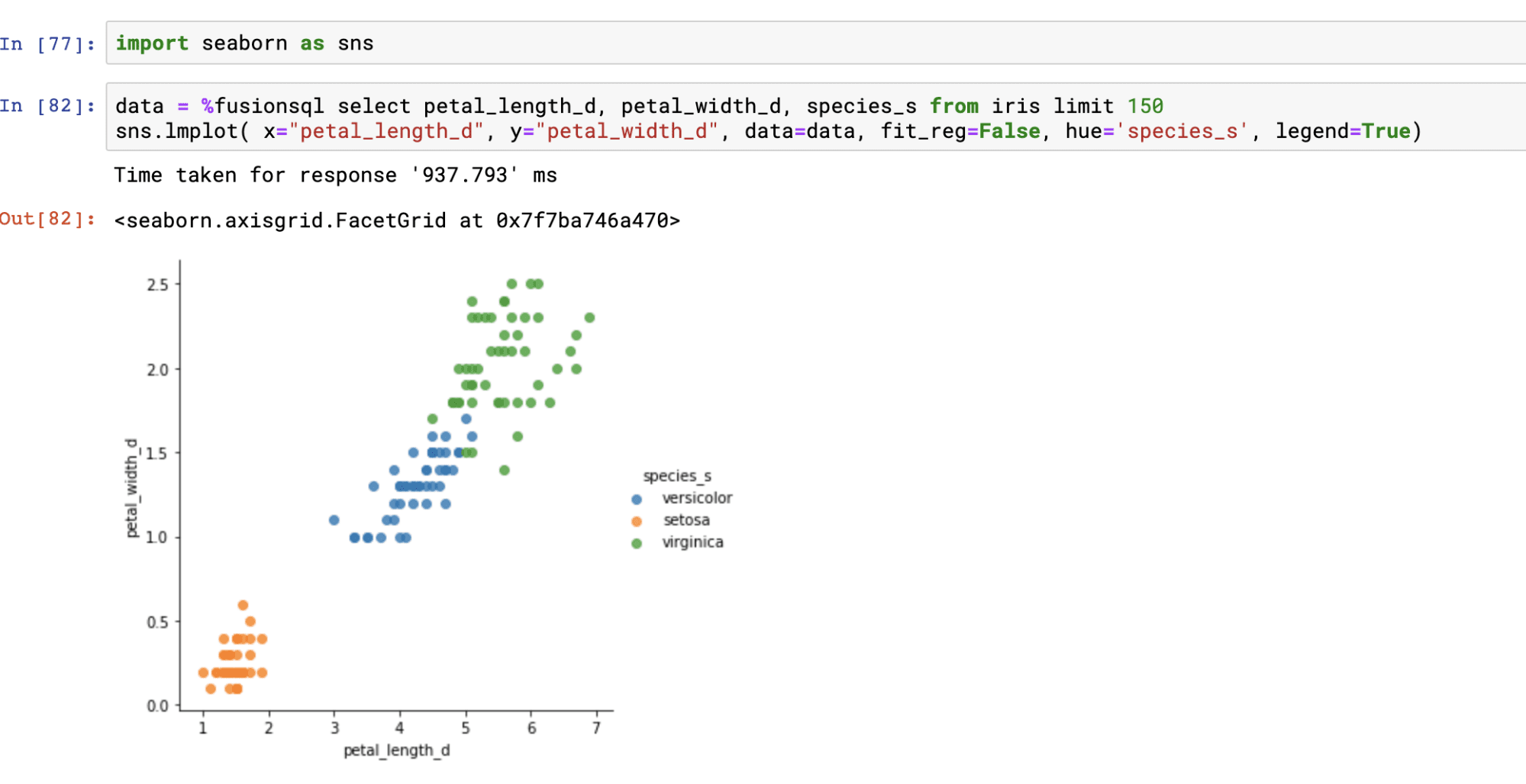
We can also add the species_s label to the visualization and color the points by species. This allows us to see the relationship between the two variables by species.
In order to add colored labels we’ll use the Seaborn Python package. In the example below the Seaborn package is imported and then the lmplot function is used to plot the labeled and colored scatter plot.
Descriptive statistics
Descriptive statistics for a result set can be calculated using standard SQL.
Aggregations and visualizations
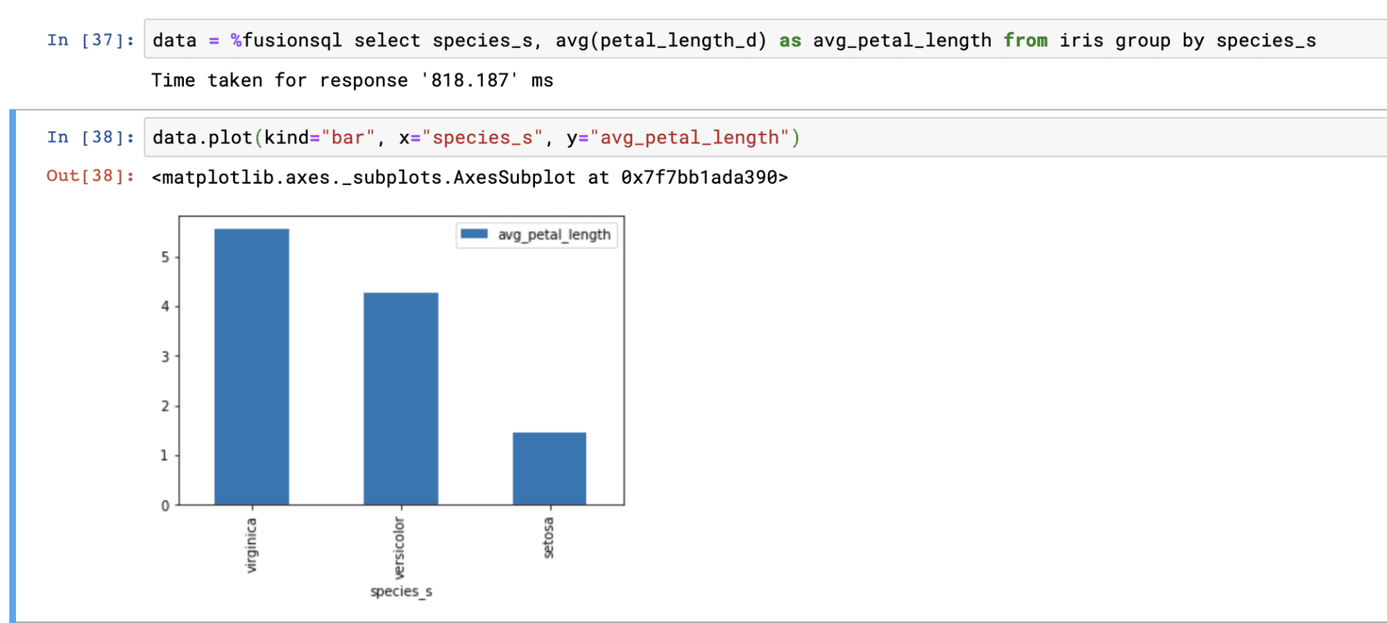
Single and multi-dimensional aggregations can be calculated using GROUP BY SQL queries.
The result of aggregations can be set to a Pandas dataframe and visualized:
Time series and visualization
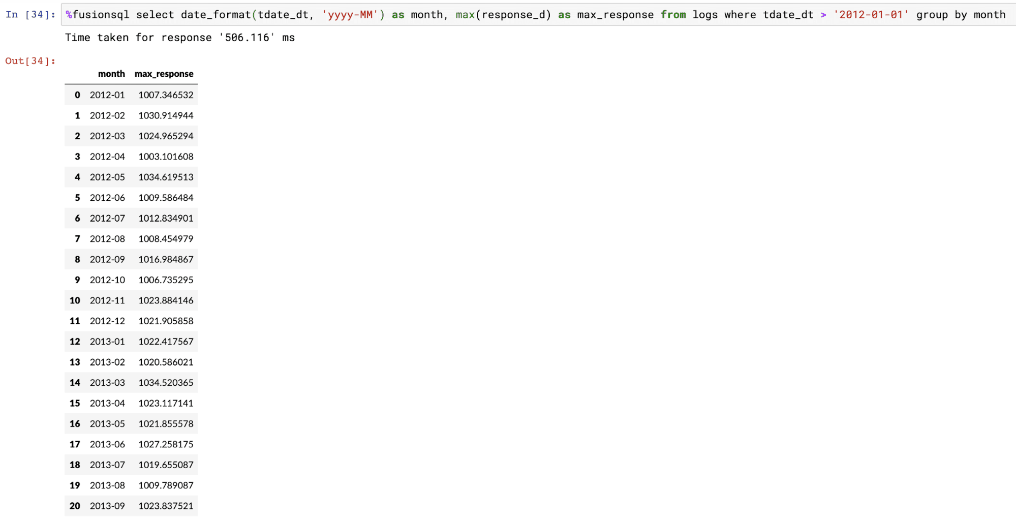
Fusion SQL has a powerful time series extension implemented through the SQL date_format function. The date_format function allows for efficient grouping over datetime fields. The date_format function also allows for the specification of the output format and the gap.
The example below shows the output of a GROUP BY query over the date_format function.
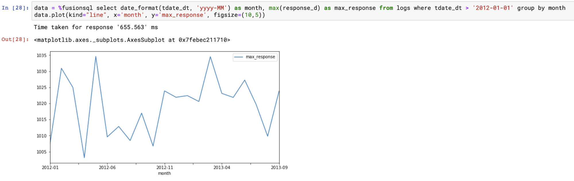
The example below shows the time series result set plotted on a line chart using the dataframe plot function.
Statistical analysis and visualizations
Fusion SQL includes a library of functions designed for statistical analysis and visualization. The section below demonstrates a subset of these functions within Jupyter notebook.
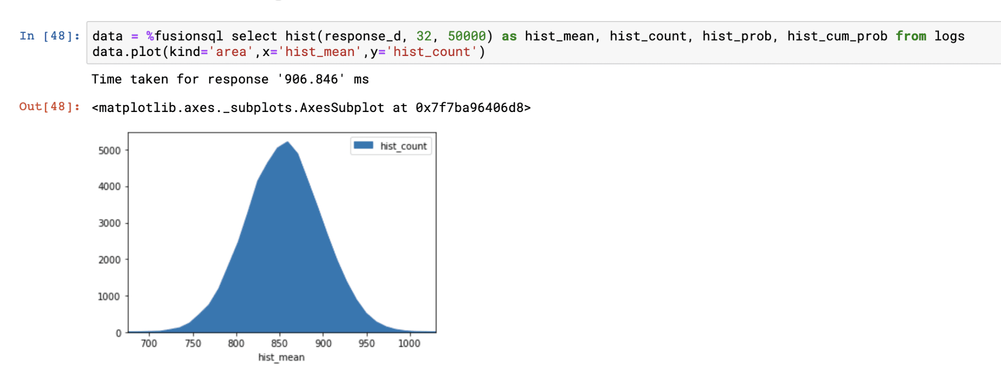
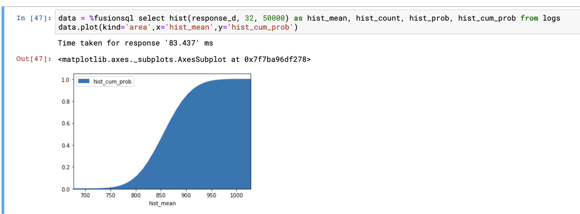
Histograms
Histograms can be created from a numeric field using the hist function. The hist function takes three parameters:
-
The numeric field to create the histogram from
-
The number of bins in the histogram
-
The sample size
The hist function returns the mean of each bin. There are three other fields available for selection when the hist function is used:
-
hist_count: The number of samples within each bin. -
hist_prob: The probability that sample will fall within each bin. -
hist_cum_prob: The cumulative probability for each bin.
Below is an example of the hist function visualized in an area chart with the hist_mean on the x-axis and the hist_count on the y-axis:
Below is an example with hist_cum_prob plotted on the y-axis:
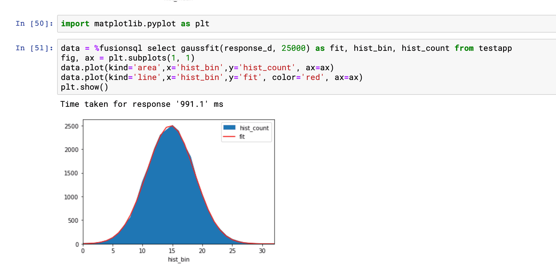
Fitting a gaussian curve to a histogram
The gaussfit function fits a gaussian curve to a histogram. You would do this to visualize how well the data in a numeric field fits a normal distribution.
The gaussfit function takes two parameters:
-
The numeric field to create the histogram from
-
The sample size
The gaussfit function returns the fitted curve at each bin in the histogram. There are two additional fields that can be selected when the gaussfit function is used:
-
hist_bin: The bin number for the histogram -
hist_count: The count of the number of samples for each bin
The example below shows the histogram and fitted curve plotted on the same figure. The example demonstrates how to run the gaussfit function and how to overlay the fitted curve on top of the histogram.
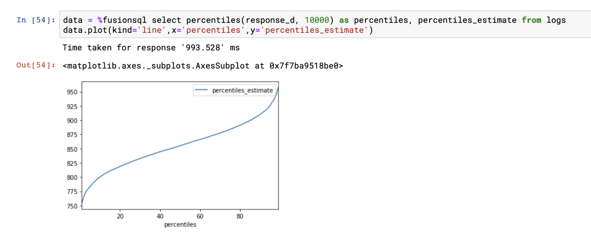
Percentiles
The percentiles function calculates percentile estimates for a numeric field. The percentiles function takes two parameters:
-
The numeric field to calculate the percentiles from
-
The sample size
The percentiles function returns the percentile (1-99). The percentiles_estimate field returns the estimated percentile value for each percentile.
Below is an example of the percentiles function plotted on a line chart:
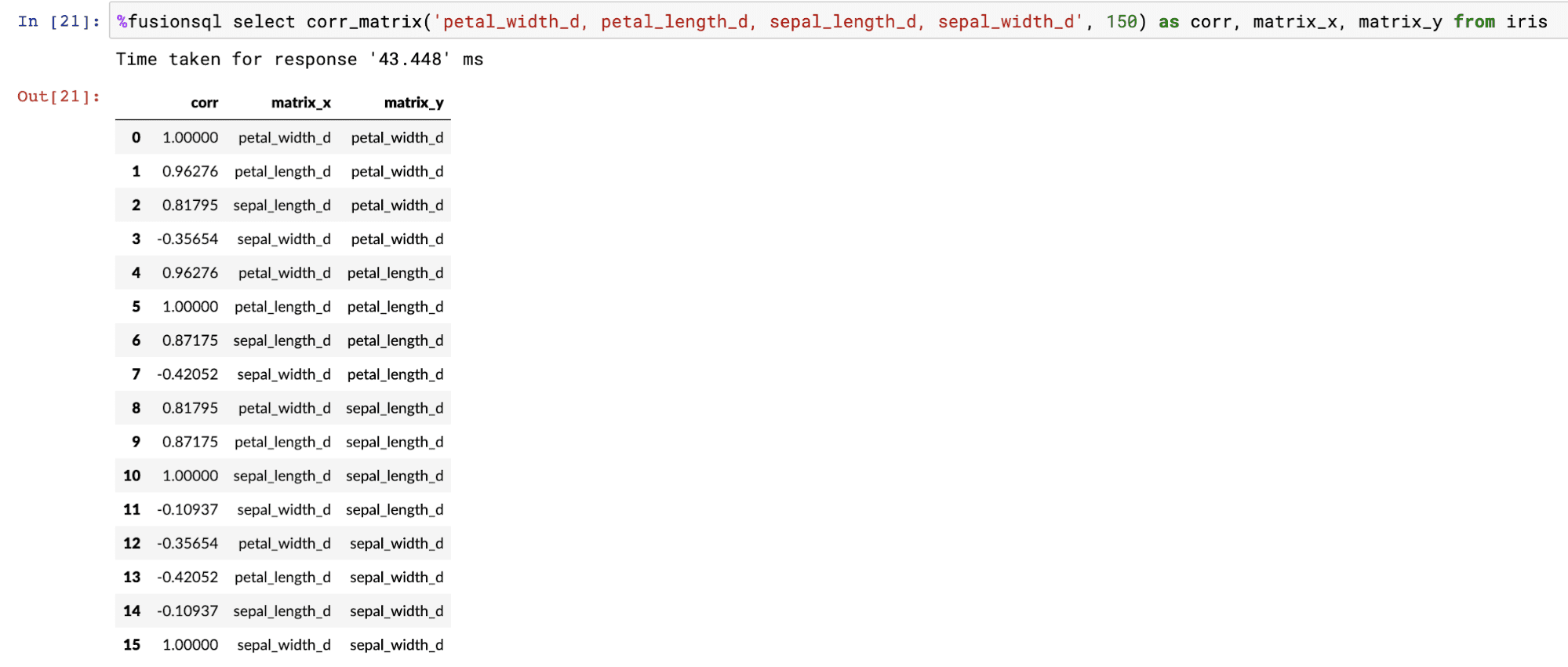
Correlation matrices
Correlation matrices can be computed using the corr_matrix function. The corr_matrix function takes two parameters:
-
A single quoted string containing a comma delimited list of fields to build the correlation matrix from
-
The sample size
The corr_matrix function returns the Pearson’s correlation coefficient for each combination of the fields. The matrix_x and matrix_y fields contain the x and y labels of the matrix.
The example below shows the output of the corr_matrix function:
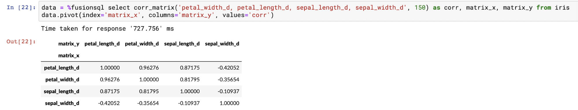
The dataframe created by the corr_matrix function can be pivoted into a matrix using the pivot function:
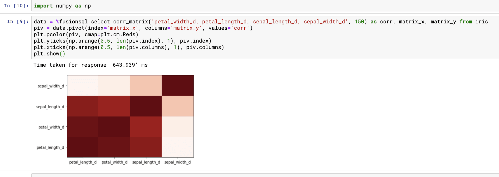
Once pivoted, the Matplotlib pcolor function can be used to display the correlation matrix as a heat map. Below is an example of how to visualize the corr_matrix function:
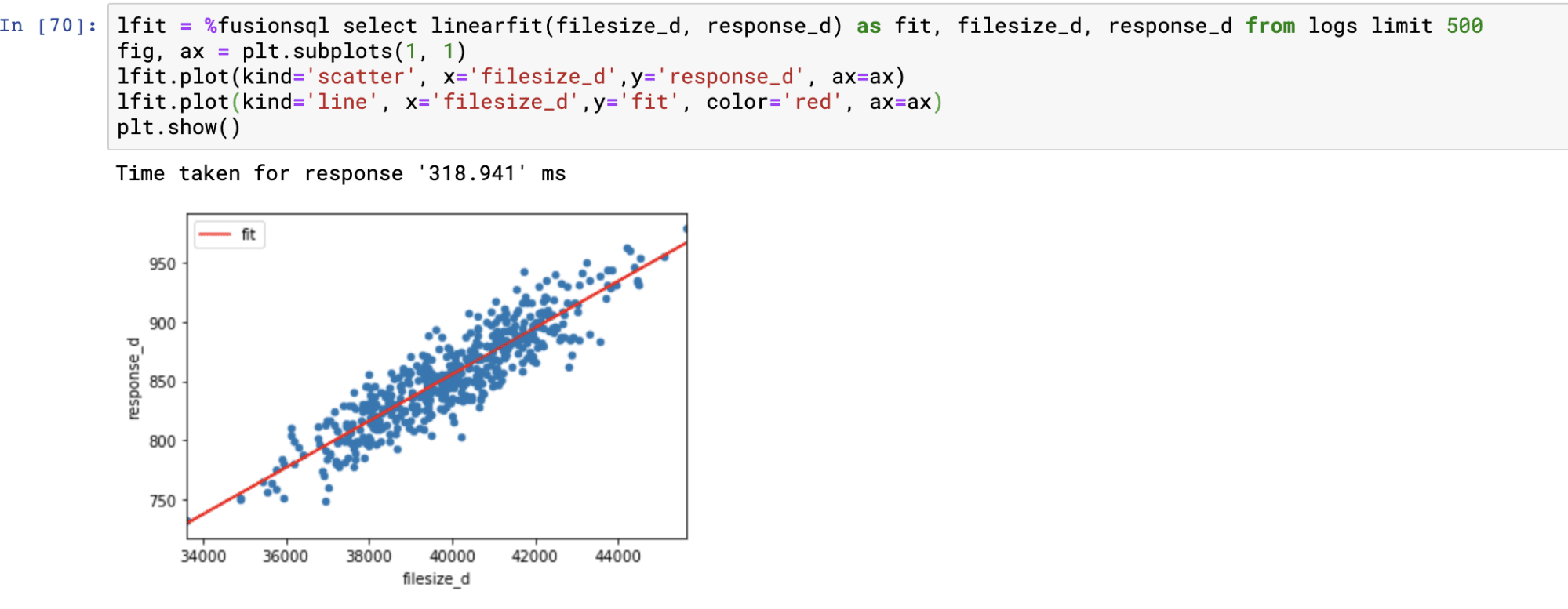
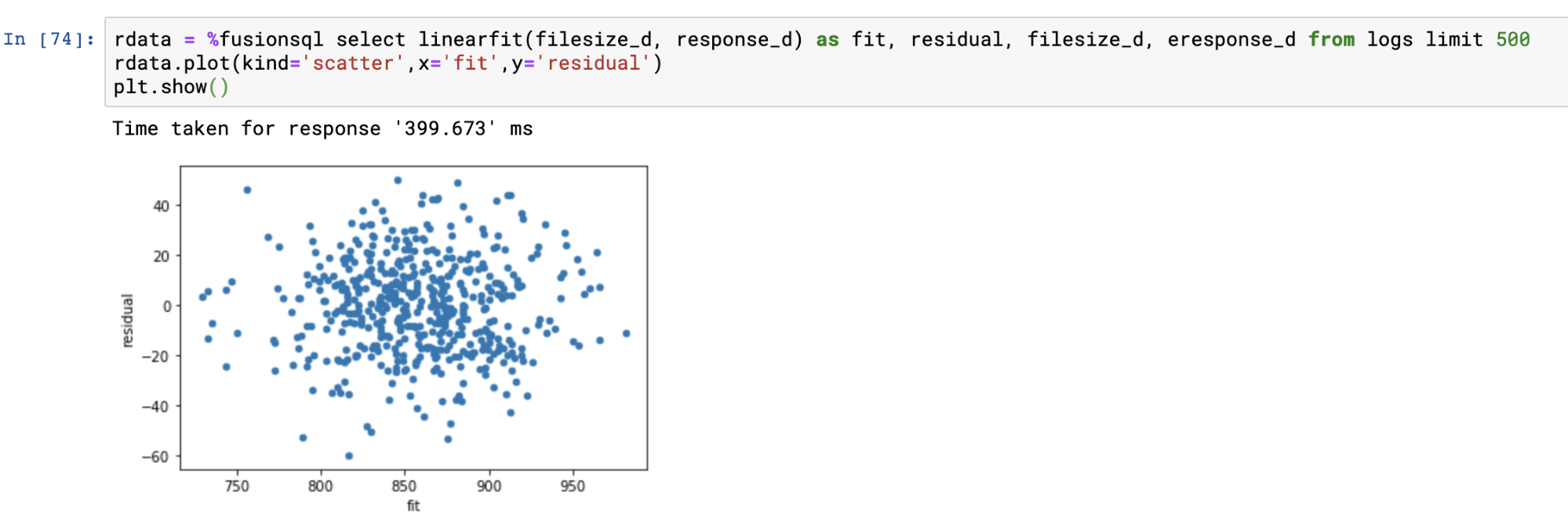
Linear regression and residual plots
The linearfit function can be used to visualize bi-variate linear regression plots and residual plots. The linearfit function takes two parameters:
-
The numeric predictor or independent variable field (x).
-
The numeric dependent variable field (y).
The linearfit function returns the predicted value for each of the predictor values. There are also three other fields which can be selected in the result set:
-
The numeric predictor or independent variable field
-
The numeric dependent variable field
-
residual : The difference between the actual value and the predicted value. This represents the error for each prediction.
Using predicted values and the residual values the regression and residual plots can be visualized.
The example below shows the regression plot. The regression plot is drawn by first plotting the dependent and independent variables in scatter plot. Then the predicted values are overlaid through the scatter to visualize how well the line fits through the points.
The residual plot is done by plotting the predictions on the x-axis and the residual values on the y-axis. The residual plot visualizes the error across the full range of predictions.
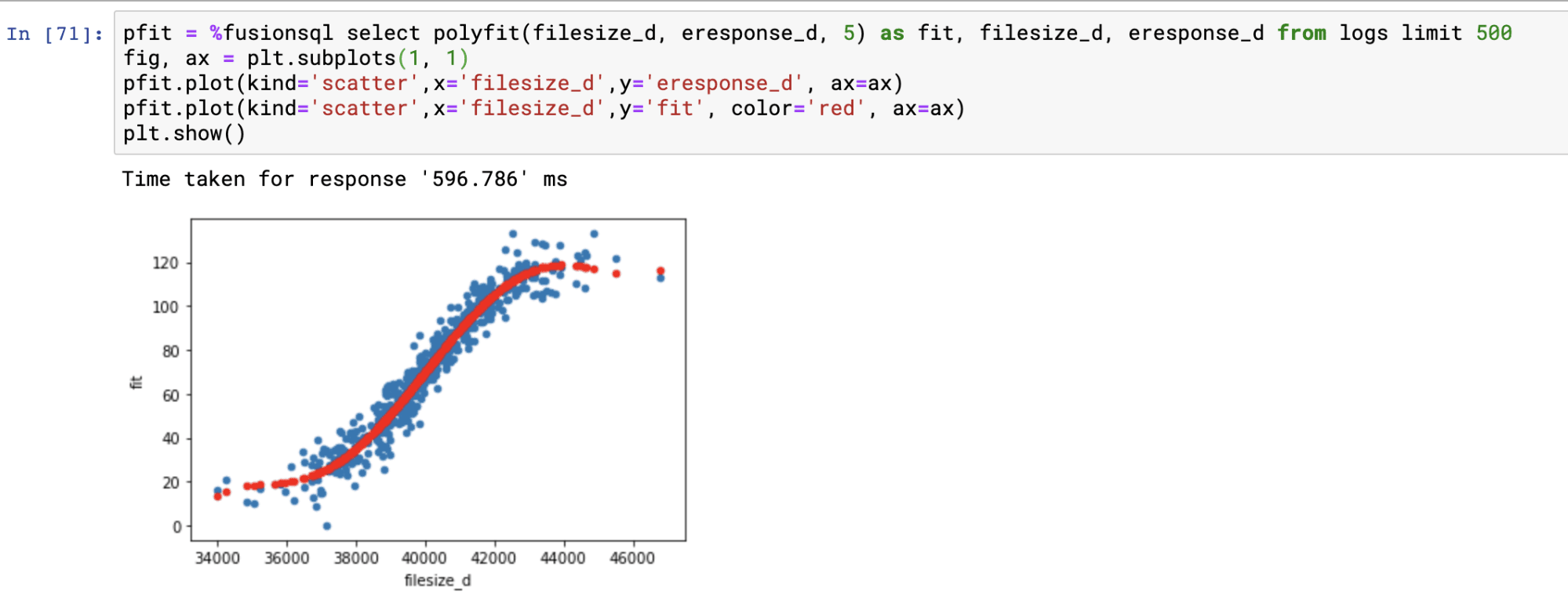
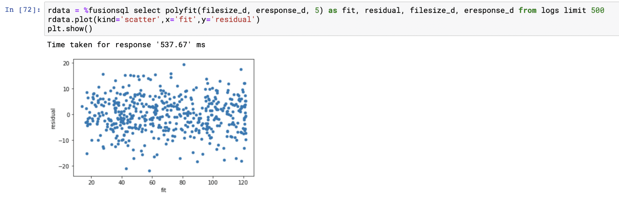
Polynomial non-linear regression
The polyfit function fits a smooth curve through a bi-variate scatter plot. The polyfit function works similarly to the linearfit function except it has one extra parameter which specifies the degree of the polynomial used to fit the curve. The higher the degree, the larger the number of curves. The degree is typically an integer between 1 and 5.
Below is an example of a regression plot using the polyfit function with a 5 degree polynomial. The only difference in the plotting technique from linearfit is that the predictions are plotted with a scatter plot. See linearfit for more details on regression plots.
The residual plot is handled in exactly the same manner as with the linearfit residual plot.
External Access
If you wish to access Fusion SQL features from an external Jupyter notebook, you can use this gist to create an access object for the service, which can be used in a similar way to the internal notebook:
    fsql = FusionSQL("https://hostname:port/api", "username", password)

    fsql.run_sql_query("select * from sql_catalog")
This will return a Pandas dataframe containing the results of the query.